Charts & Chit Chat: 11 Charts Not For The Faint Of Heart
Charts & Chit Chat: 11 Charts Not For The Faint Of Heart
How Bad Is The Economy Doing?

Here at Simply Finance we give you a high level of Financial Data alongside relatable stories that make it easier for you to learn.
Let’s put some personality back in Finance.
Don’t be shy to hit the “like” button, share this post, and become a subscriber to this entirely FREE NEWSLETTER if you haven’t done so already!
Today’s edition is part of Charts & Chit Chat where I share Financial Data/Charts alongside quick takeaways that get right to the point.
My weekly Video Post will be next, and you can think of that as a coaching call where I chat about whatever is most relevant over the last week.
And of course we’ll have another edition of My Stories released within the next few days. That’s a long forum post where I share vulnerable thoughts around my opinions in Finance.
For now, let’s look at some data and get right to the point.
Below is a recap of my favorite Finance visuals and notes over the last week.
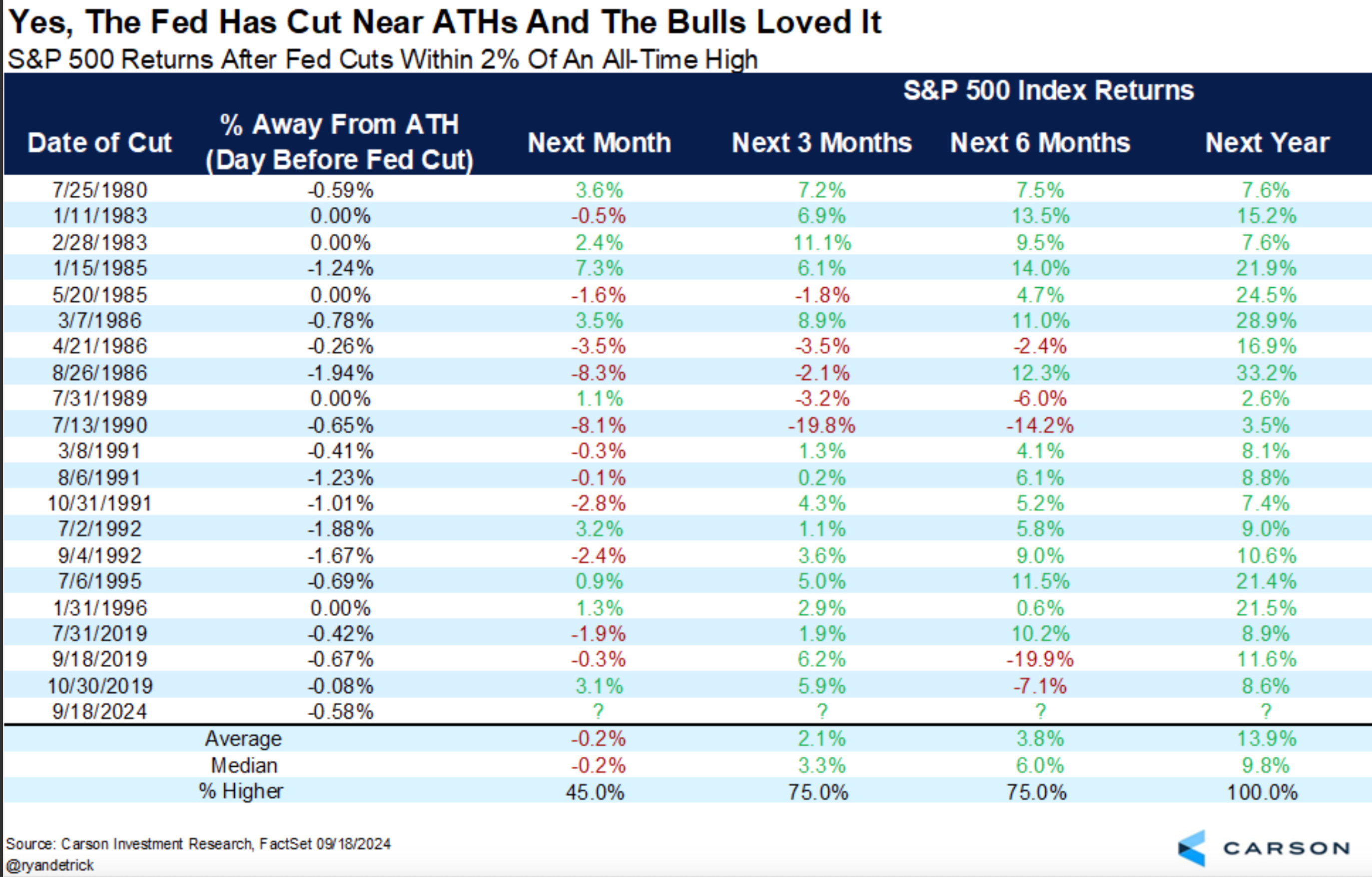
Since 1980, the FED has cut rates with the S&P 500 around All Time Highs 20 times.
The S&P 500 was higher 100% of the time 12 months later.
The average 12 month return during that time was +13.9%.
The median 12 month return during that time was +9.8%.
Takeaway: Interest Rate Cuts when the S&P 500 is within 2% of its All Time High have produced above average positive 12 month returns.
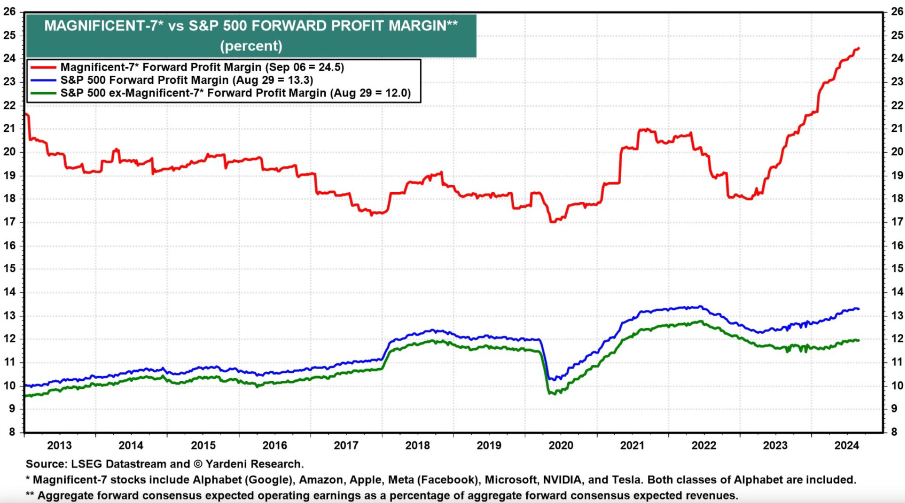
Here is the forward profit margins for the Mag 7 stocks (red line) vs the other 493 stocks (green line) and the S&P 500 in total (blue line).
The forward profit margins for the Mag 7 stocks blow the other 493 stocks out of the water.
The Mag 7 is simply making more money than the other 493 companies combined.
Takeaways: Maybe the stock prices for the Mag 7 stocks are justified considering they are the ones making all the money.
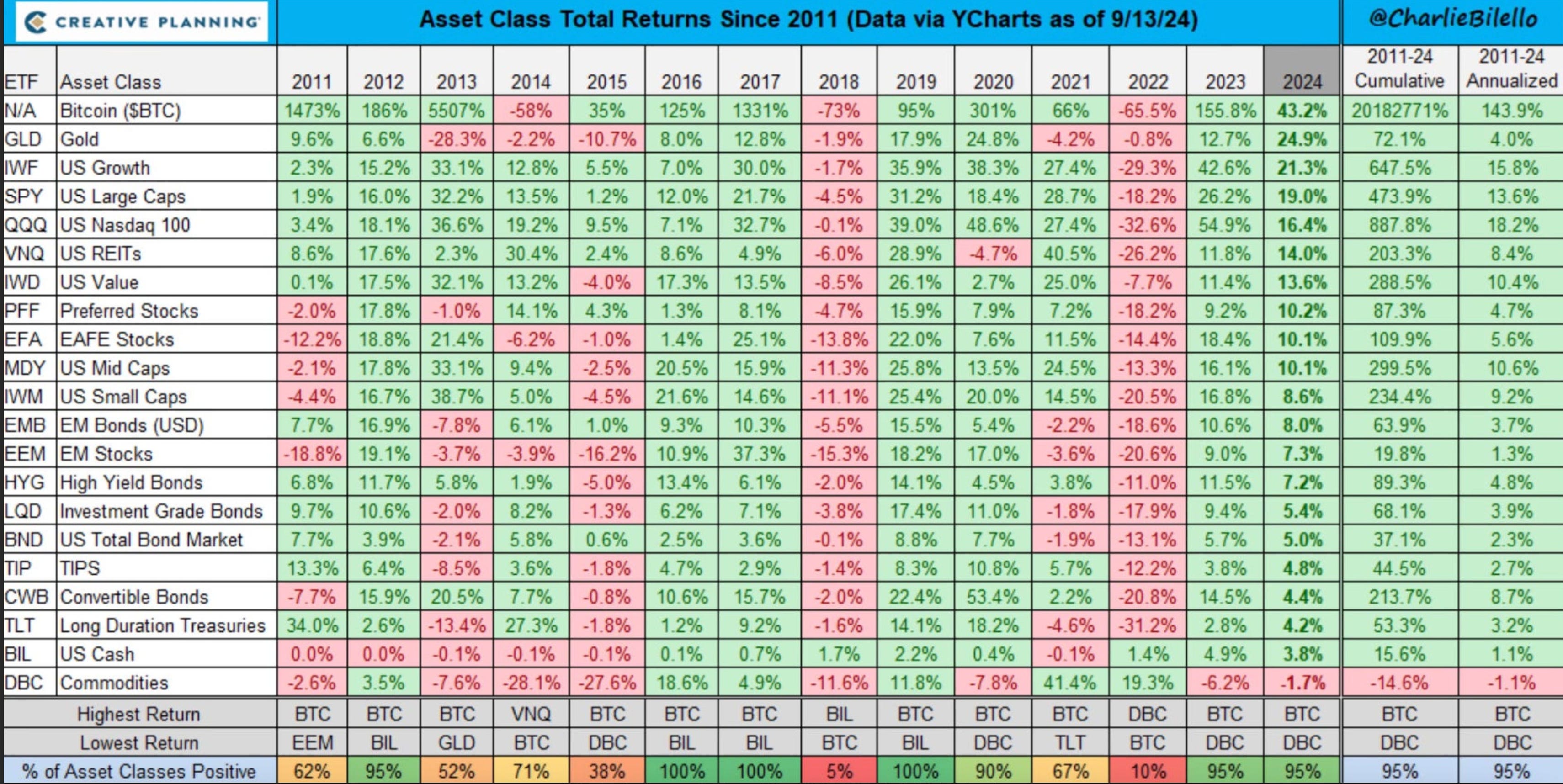
Very cool visual here showing the 12 month returns for every asset class since 2011.
Bitcoin has been the best performing asset 3 years in a row and then the worst performing asset for 1 year.
It will be interesting to see if that pattern continues to hold.
2024 would be year 2, indicating that there is still 1 more year of green left on the board before the red year.
Also interesting to see how few asset classes Gold beats. The one’s it does beat are only bond products.
Takeaway: The markets and economy tend to work in cycles of 3 good years to 1 bad year. Bitcoin tends to perform best in the good years, but the worst in the bad years. Overall it’s still the best performing asset of the bunch.
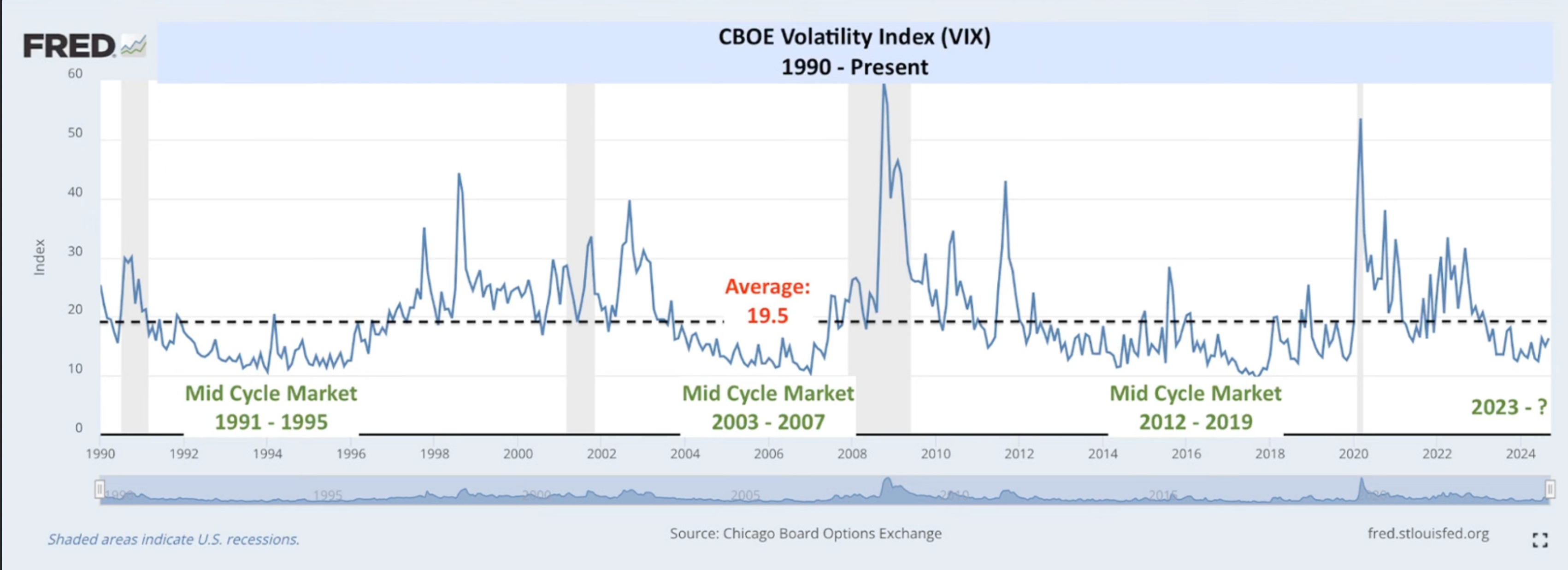
The VIX is a measure of volatility in the S&P 500.
The VIX is inversely related to the S&P 500. It moves higher when the S&P 500 moves lower, and vice versa.
The VIX spends most of its time below 20 or so.
When it’s below 20 you might hear people saying, “volatility is low and it’s due for a spike higher.”
But the VIX stays below 20 for very long periods of time, and the few spikes above 20 are typically short lived.
This is a good indication of how down moves in the S&P 500 are also typically short lived.
Takeaway: Volatility stays low an overwhelming majority of the time, despite everyone always looking for the next big crash “right around the corner.”
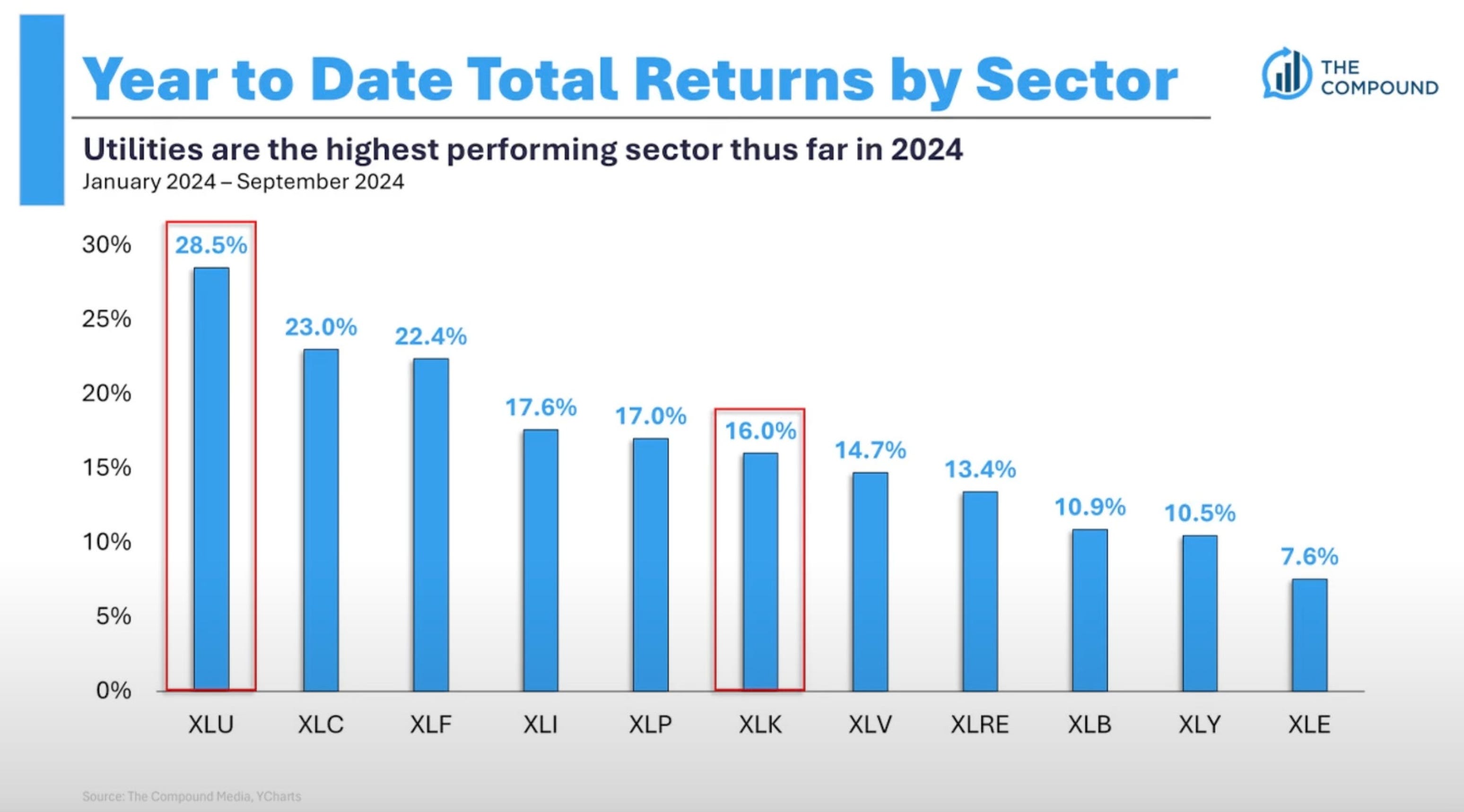
This chart shows the Year To Date returns by sector so far this year.
XLK is the technology sector, and you can see it’s in the middle of the pack.
This is a good example of how it’s not just technology that is pushing the market higher.
The stock market rally is a broad-based rally higher across various different sectors.
Takeaway: There are many sectors performing well in the market this year and even beating the technology sector’s performance thus far.
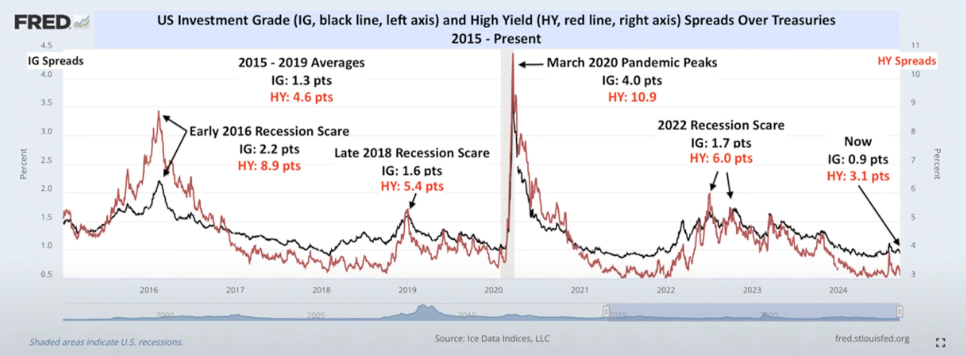
This chart shows the credit spreads for Investment Grade Bonds (black line) and High Yield Bonds (red line).
Spikes in this chart coincide with crisis in the markets.
In times of crisis, the spreads for both will spike higher relative to Treasury Bills. This indicates more risk and a lack of liquidity in the bond market.
The High Yield Bond spreads also spike much higher than the Investment Grade Bond spreads, which are the safer and lower yielding investment.
Neither of those things are happening right now though, and that is the bond market telling us it does not see any concerning risks at the moment.
Takeaway: The bond market is showing no signs of crisis in the economy.
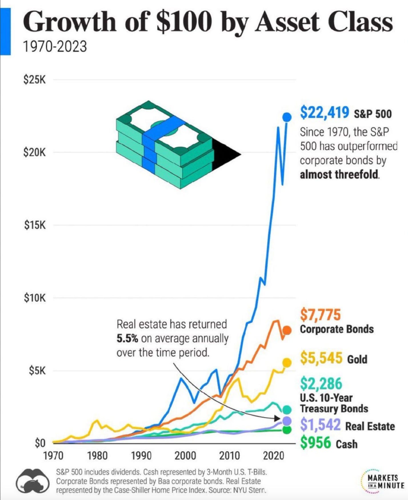
Here is the growth of $100 invested in different asset classes since 1970.
Two things stand out to me here.
The S&P 500 (blue line) is clearly where you want to put your money.
Gold (gold line) kind of sucks. It didn’t even beat the returns of Corporate Bonds.
Takeaway: The S&P 500 has been the best performing asset class compared with Corporate Bonds, Treasury Bonds, Gold, Real Estate, or Cash — with over 3X better performance than the 2nd best performing asset class.
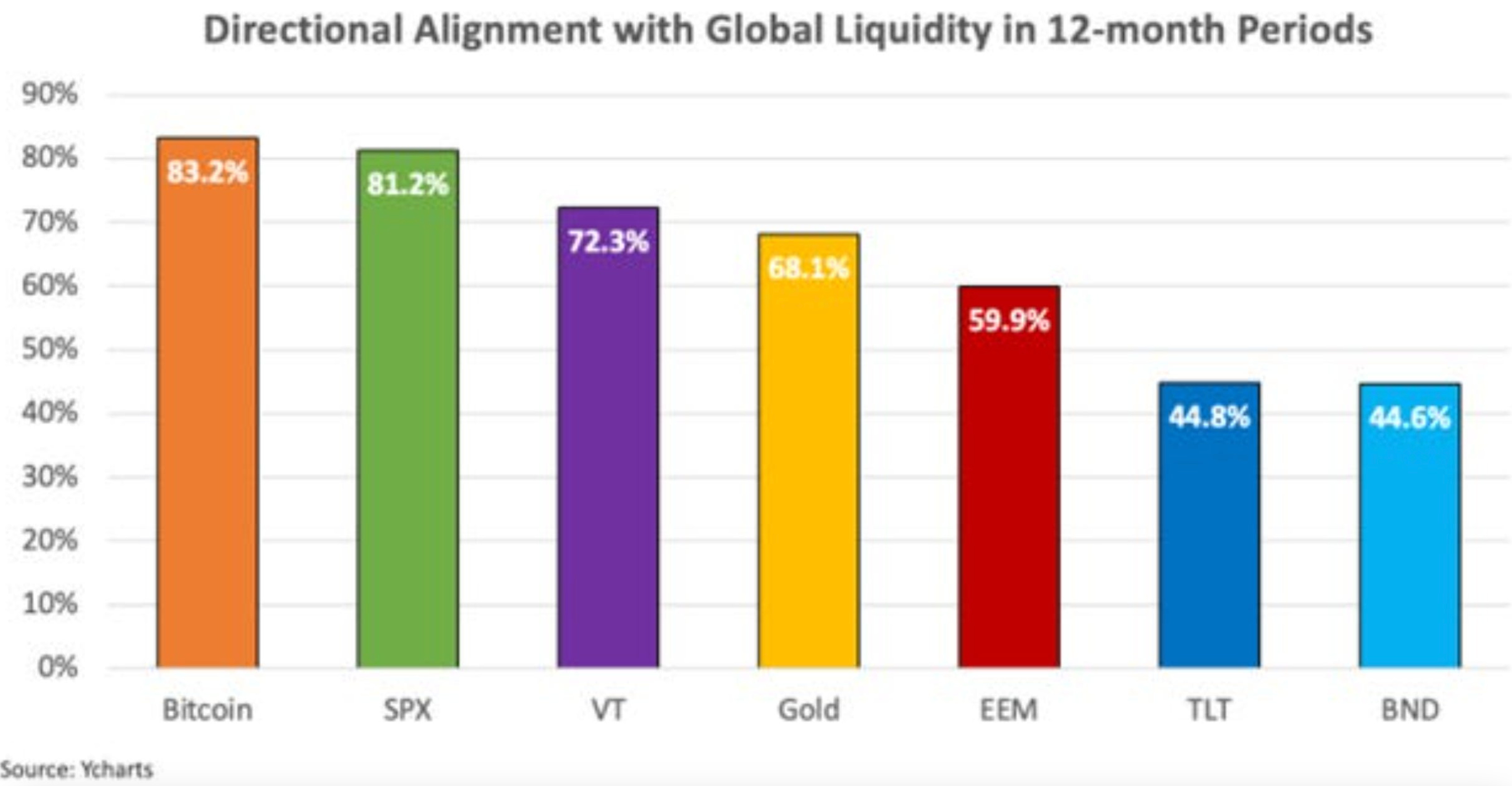
Cool chart here showing the correlation between Global Liquidity (M2 money supply) and different asset classes.
Bitcoin (orange column) is the most correlated to moves in Global Liquidity, followed by the S&P 500 (green column).
This simply means when the money supply expands, Bitcoin and the S&P 500 appreciate the most in price compared with other asset classes.
M2 money supply is just starting to expand in percentage terms relative to 1 year ago, I showed this in my last Charts & Chit Chat edition.
Takeaway: Bitcoin and the S&P 500 tend to move very closely with expansions and contractions in Global Liquidity.
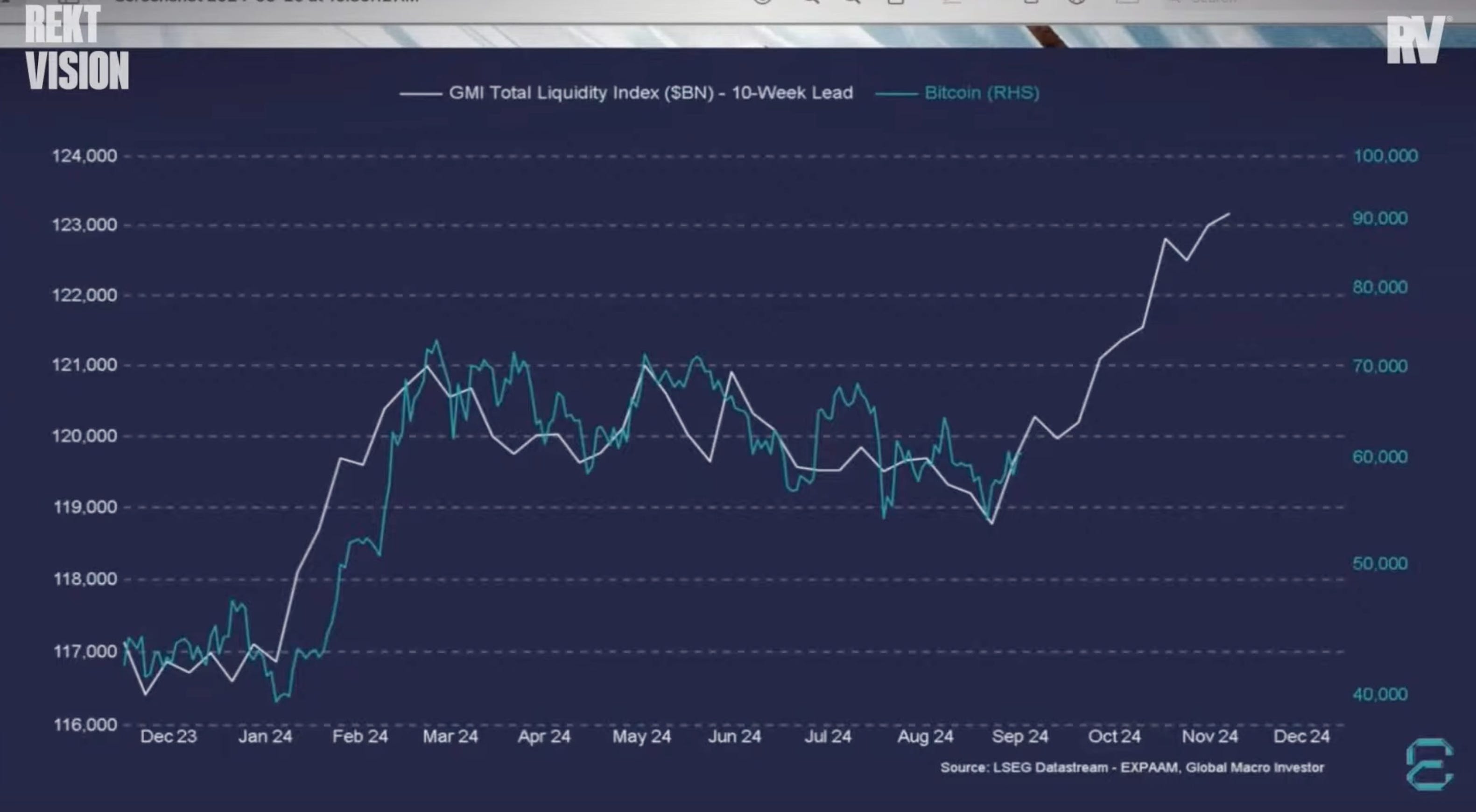
The GMI Total Liquidity metric (white line) in this chart is a measure of total Public and Private liquidity across the largest economies.
It tends to lead Bitcoin by 10 months.
It’s been tightly correlated thus far.
Takeaway: Total Liquidity is projected to increase drastically over the next 10 months, which suggests Bitcoin will follow closely along with it.
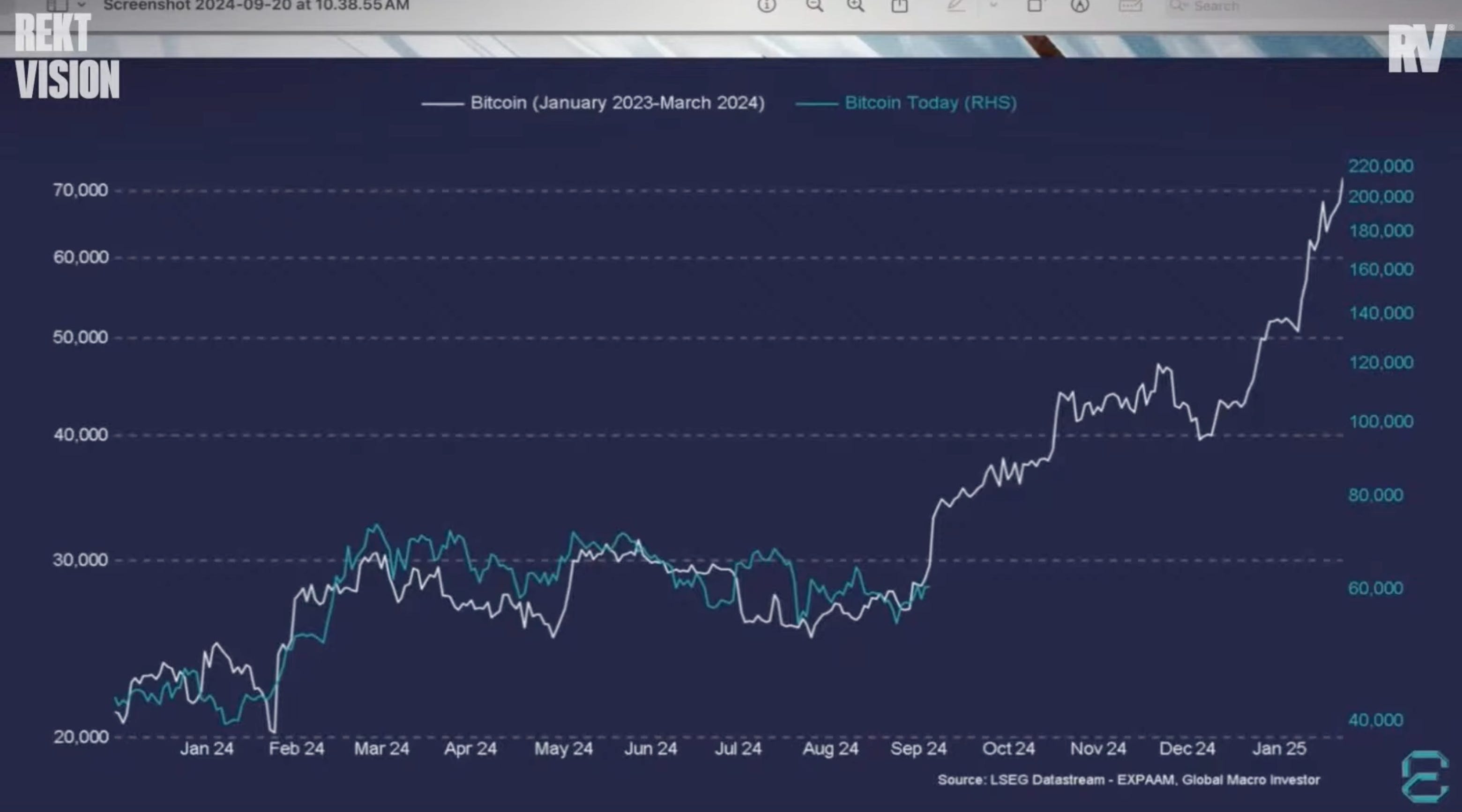
Over the last 9 months, Bitcoin is following the same pattern it was doing from January 2023 - March 2024 (white line).
During that time, Bitcoin had a strong 2 month move higher followed by a good 6 month period of sideways movement.
It then went on to push aggressively higher over the next 4-5 months.
We are now approaching that same 4-5 month period.
Takeway: Bitcoin has been following the same pattern it did in 2023, and if it continues it would suggest an aggressive move higher in Bitcoin is coming over the next 4-5 months.
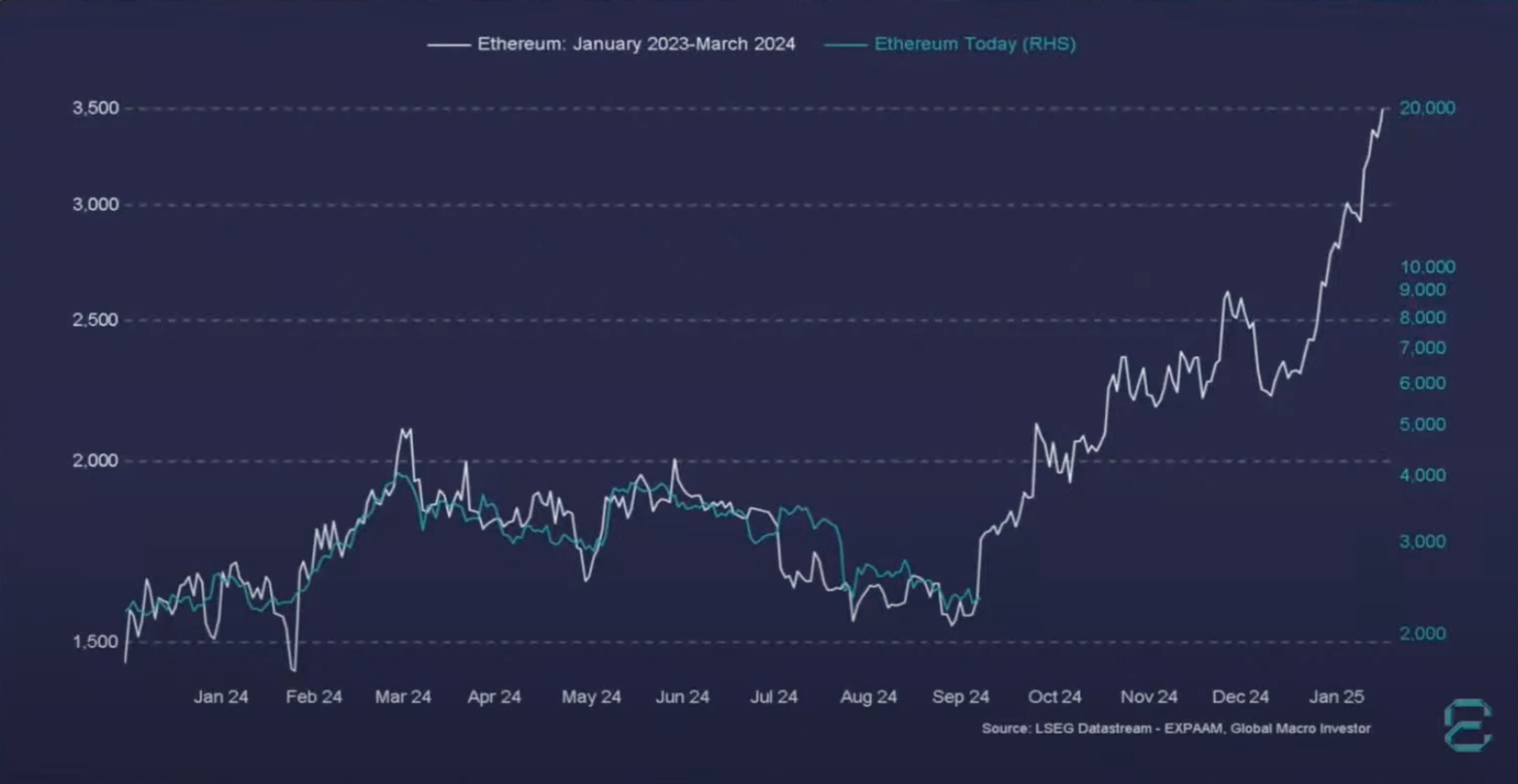
It’s not just Bitcoin either.
Over the last 9 months, Ethereum is also following the same pattern it was doing from January 2023 - March 2024 (white line).
During that time, Ethereum had a strong 2 month move higher followed by a good 6 month period of down movement and significant underperformance relative to Bitcoin.
It then went on to push higher aggressively over the next 4-5 months.
We are now approaching that same 4-5 month period.
Takeway: Ethereum has been following the same pattern it did in 2023, and if it continues it would suggest an aggressive move higher in Ethereum is coming over the next 4-5 months.
I hope you enjoyed reading Simply Finance.
I write a small FREE NEWSLETTER here, so if you enjoyed this post the best way to help me out is to share it with others!
And don’t forget to subscribe so you don’t miss the next edition!
Disclaimer: These are not recommendations and I am not a financial advisor. These are just my two cents, or two satoshis as the kids say. Remember to do your own homework before making any financial decisions. Also, keep in mind I usually have some personal investments in the things I discuss.