

Charts & Chit Chat: 12 Must See Charts & Takeaways In This Bull Market
Charts & Chit Chat: 12 Must See Charts & Takeaways In This Bull Market
A Finance Newsletter For Busy Professionals That Gets Right To the Point

Today’s edition is part of Charts & Chit Chat where I share Financial Data/Charts alongside quick takeaways that get right to the point.
My weekly Video Post will be next, and you can think of that as a coaching call where I chat about whatever is most relevant over the last week.
And of course we’ll have another edition of My Stories released within the next few days. That’s a long forum post where I share vulnerable thoughts around my opinions in Finance.
For now, let’s look at some data and get right to the point.
Below is a recap of my favorite Finance visuals and notes over the last week.
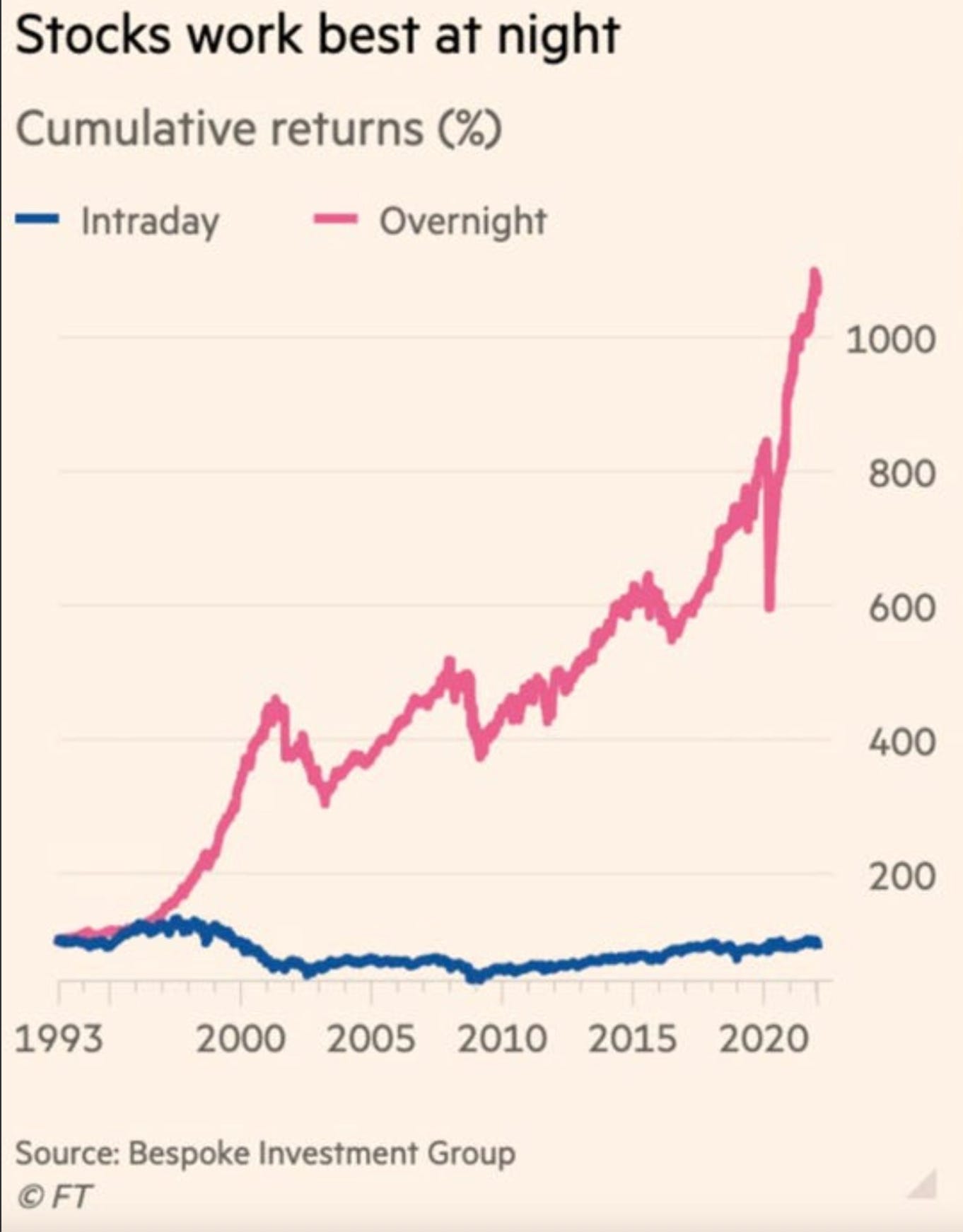
The market moves during regular trading hours from 9:30am - 4pm ET, but there is also movement in the after-hours.
That’s the overnight session. That’s what causes markets to open the morning higher or lower from the previous day’s close.
This chart shows an overwhelming amount of percentage points coming in the overnight session (pink line) compared with the intraday session (blue line).
It’s no wonder the buy and hold investors tend to outperform the intraday speculators.
Takeaway: The S&P 500 tends to make most of its moves in the overnight sessions.
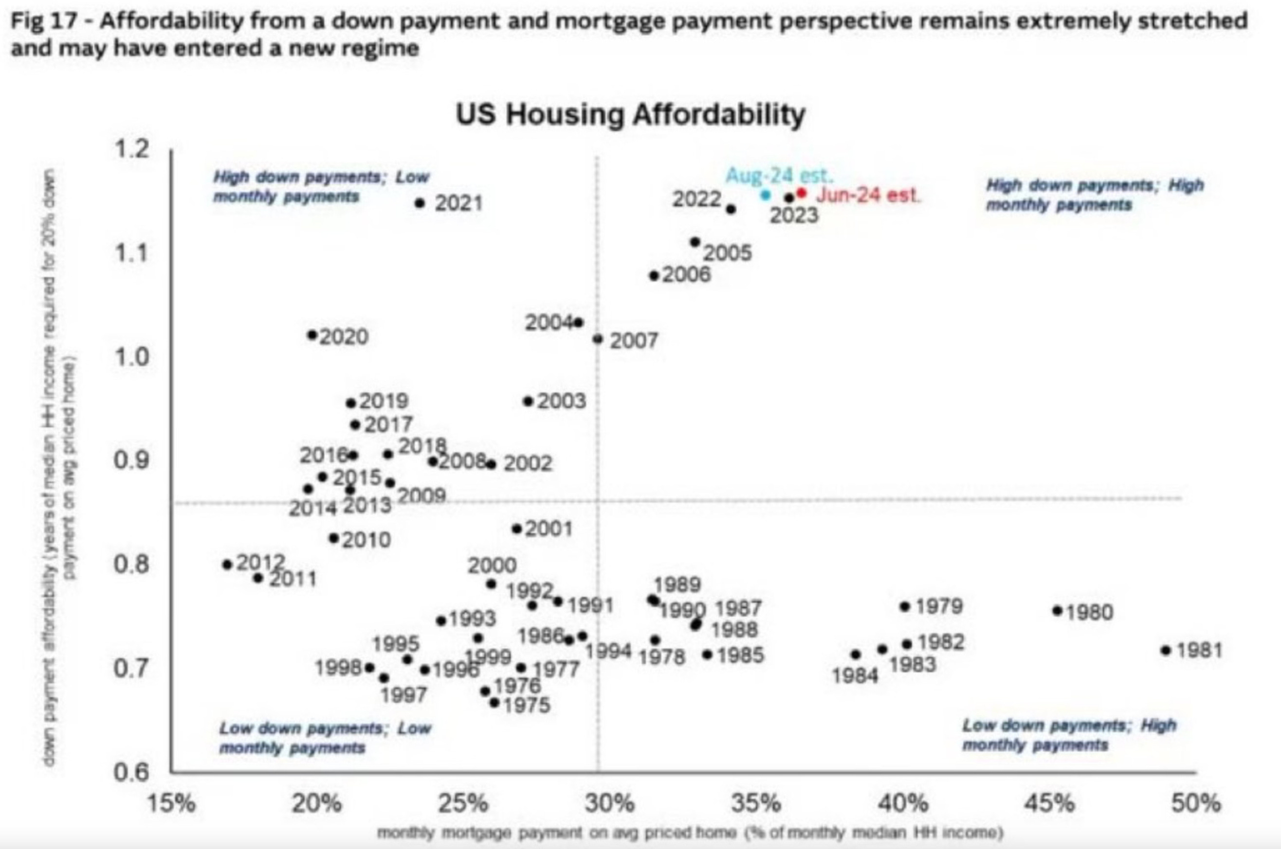
This is a chart of US Housing Affordability through the years. Each black dot represents a different year over time.
The top right quadrant shows the years in which there was a high down-payment and high monthly payment. That’s the worst of the worst.
2024 is shaping up to be the most unaffordable housing market in history, after 2023 and 2022 of course.
Something tells me 2025 isn’t going to be much easier.
Takeaway: Housing affordability has been getting worse and worse, despite the interest rate hikes the FED did for a year and a half.
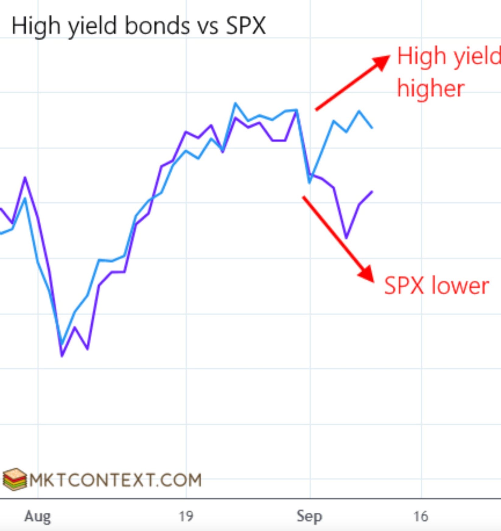
There is an interesting divergence here between high yield bonds (blue line) and S&P 500 (purple line).
Typically an increase in demand for high yield bonds is an increase in risk appetite amongst investors.
That’s why the S&P 500 usually follows.
There’s been a short term disconnect, but SPX just came off a strong week last week and is getting a little follow through so far this week.
It might be playing catch up to high yield bonds here.
Takeaway: There is a divergence between high yield bonds and SPX that is creating a gap which is likely to close soon.
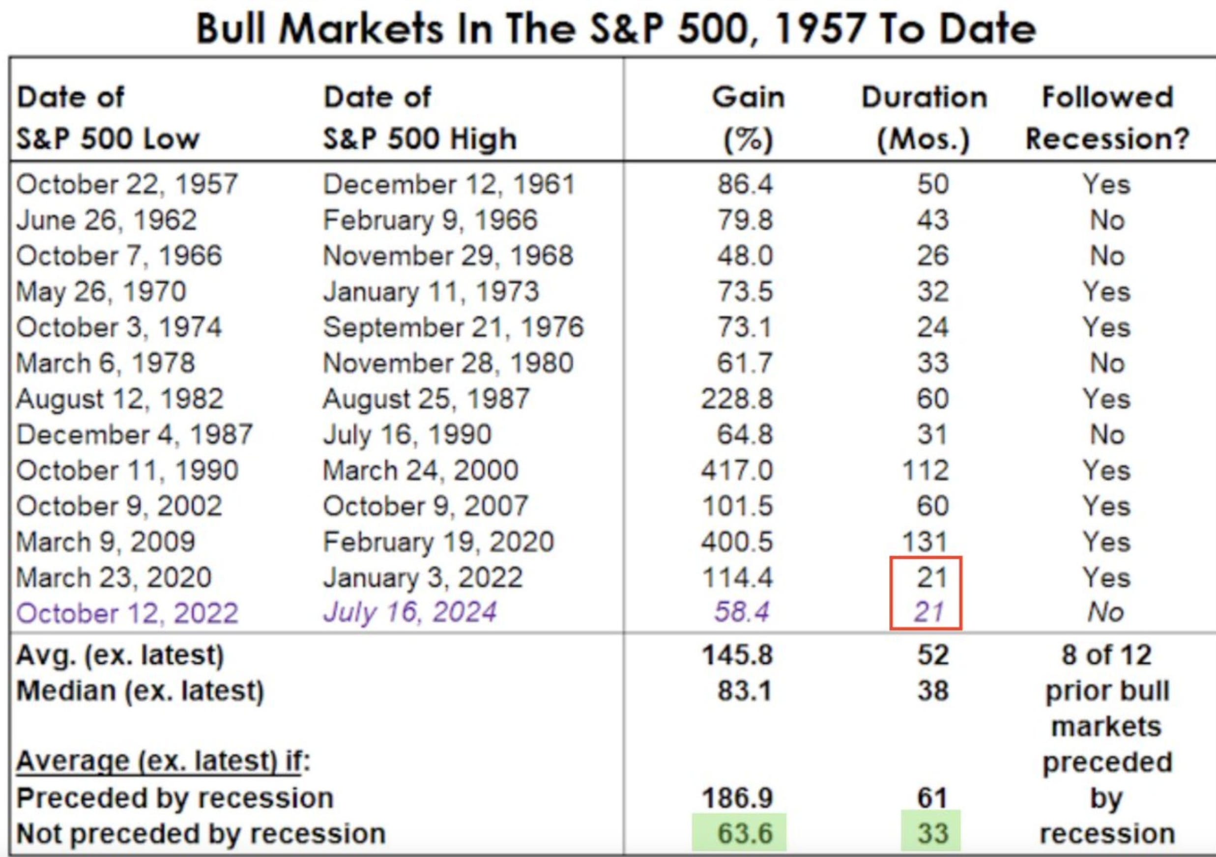
The shortest bull market was 21 months, from March 2020 to January 2021.
This chart shows the last All Time High in the market was set on July 2024, which is 21 months after the October 2022 lows.
However, we recently just set a new high in September 2024. So that’s at least 23 months in this current bull market now.
The average bull market (that is not preceded by a recession) is 33 months.
In this case that would take us out to May 2025.
At the moment this current bull market also has the 2nd smallest gain at +58.4%, after 1966 - 1968 which returned +48%.
Takeaway: This current bull market is still on the smaller end of duration and percentage gains relative to all the others throughout history.
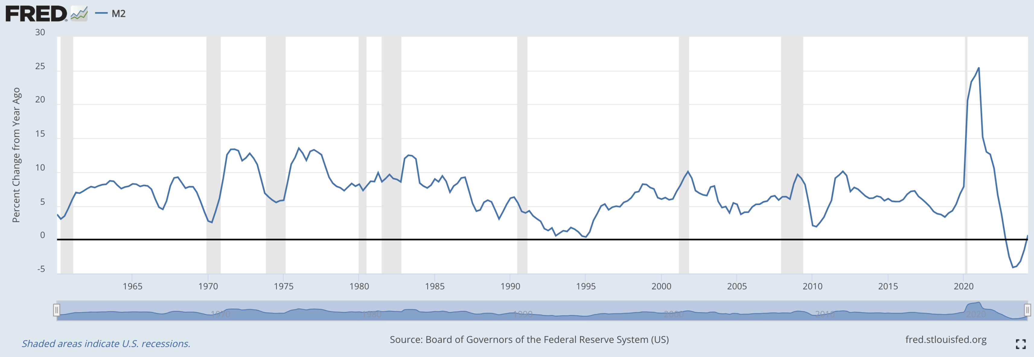
M2 is a measure of the money supply. Essentially, how much money is in the economy.
When it is rising it is a sign of new money entering the economy. This is typically a tailwind for asset prices.
This is the M2 percent change from 1 year ago, and it’s just starting to cross over into positive territory.
Takeaway: The money supply is expanding relative to 1 year ago, which has historically provided a tailwind for asset prices.
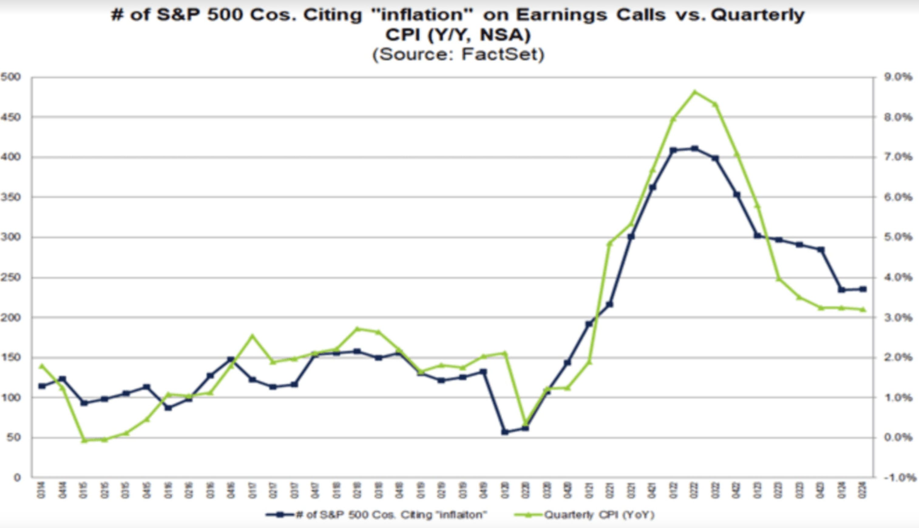
As the CPI inflation number starts moving lower (green line) the number of S&P 500 companies citing inflation in their earnings reports (black line) also decreases.
Takeaway: Companies in the S&P 500 are worrying less about inflation these days.
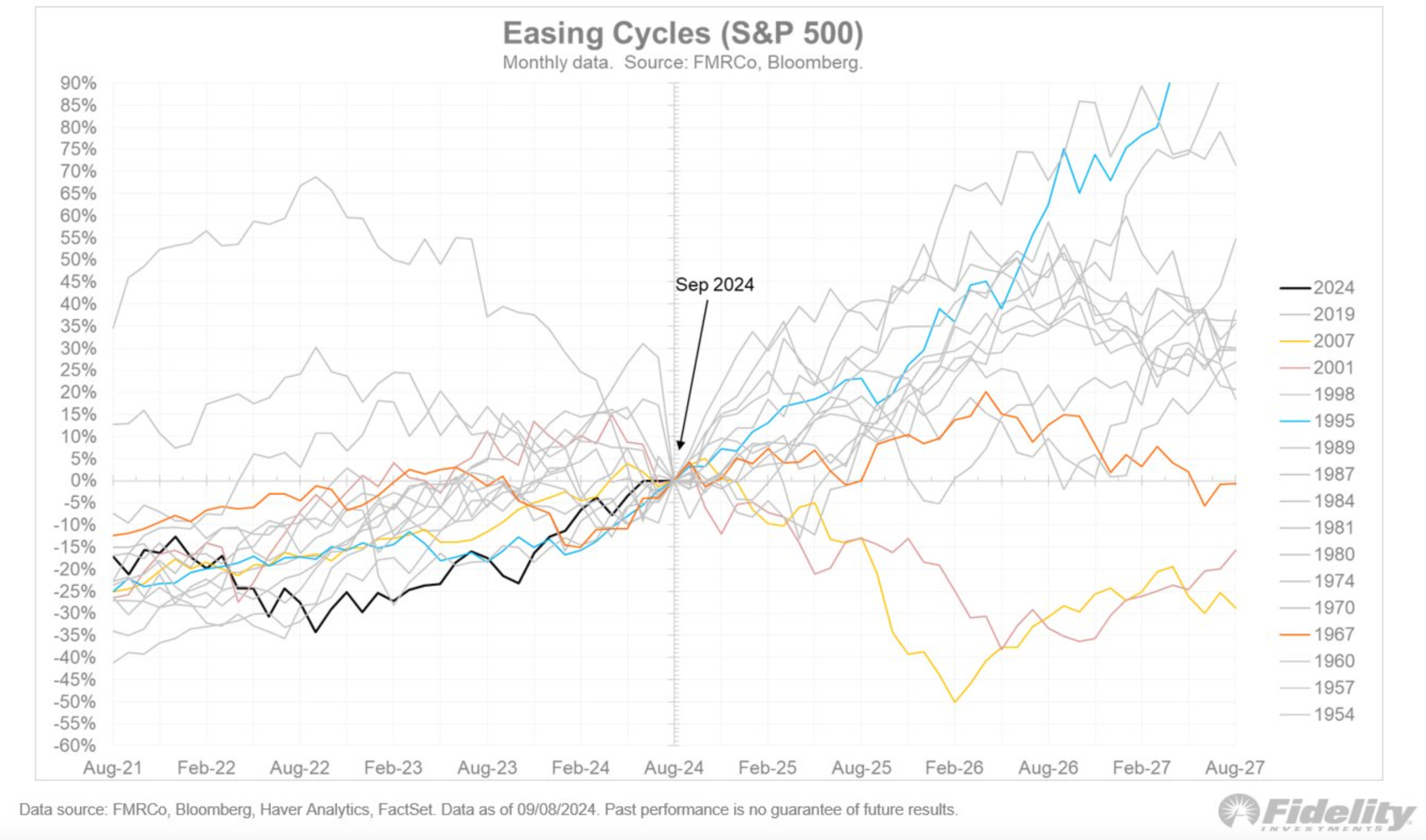
Here are all the easing cycles 3 years before and 3 years after the first rate cut.
The only two negative ones 3 years after the first rate cut came in 2001 and 2007.
That’s the Dot Com Bust and the Housing Crisis Bust.
All the Doomers bring out those two examples every time they want to spew some nonsensical fear into the market.
They completely ignore the other 90% of the time when the S&P’s are positive during rate cutting cycles.
Takeaway: An overwhelming majority of rate cutting cycles have provided positive 1-2-3 year returns for the S&P 500.
If you have avoided tech (blue line) over the last year (really the last 16 years actually) you have greatly underperformed.
Everyone talks about the risk in tech, but they completely ignore the risk of underperforming against tech.
Depending on when exactly you started bashing the tech sector, you could be down 20%, 50%, 200%, 1,000% being invested in something else rather than tech.
That is absolutely no different than being invested in the “risky tech sector” and seeing a drawdown that is 20% worse when that “big crash” comes that you have been banging the table about for 1, 3, 5, 16 years now.
Takeaway: Underperforming against the better asset classes is a hidden risk that not enough people pay attention to or talk about.
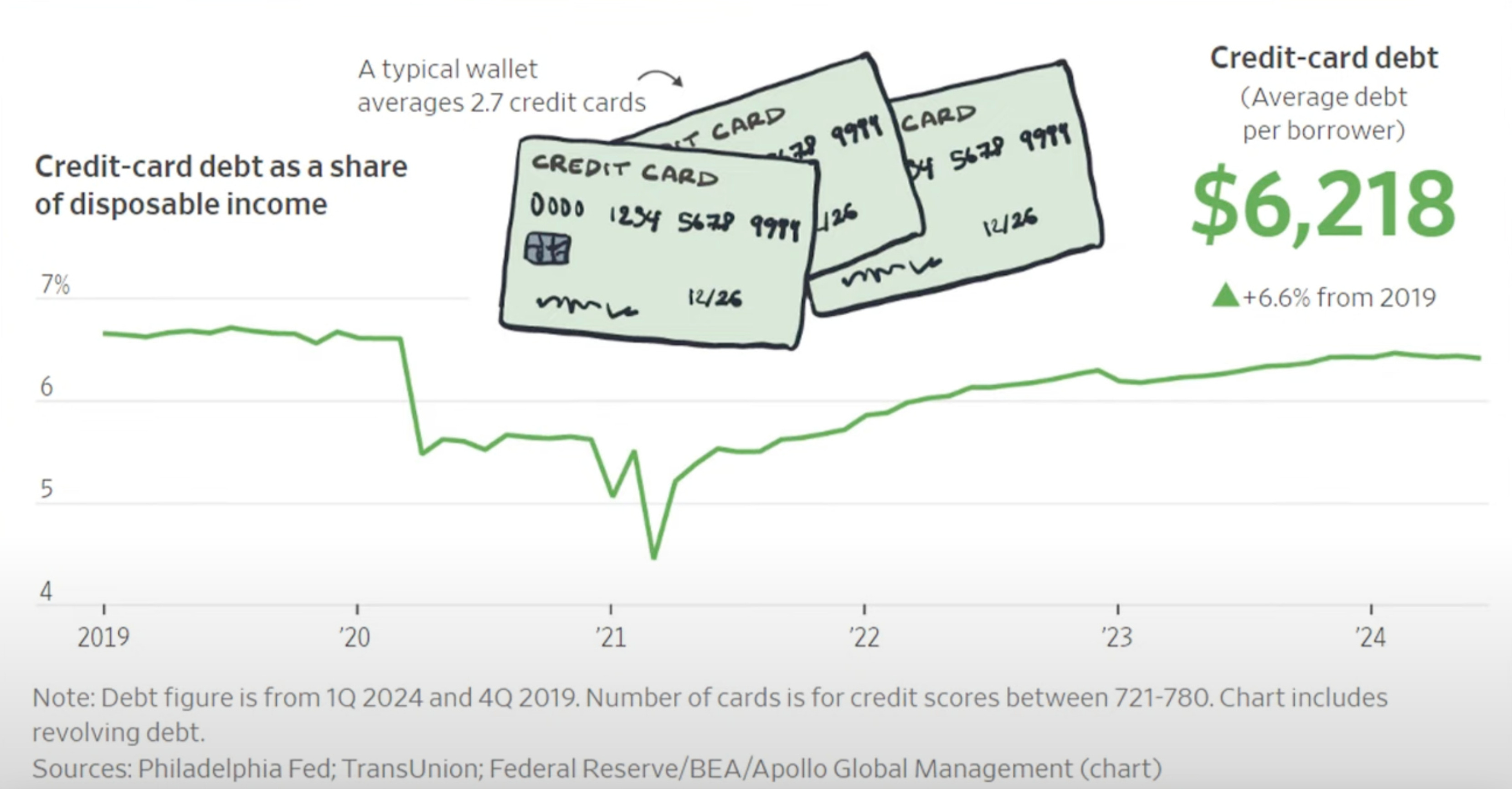
The Doomers love to talk about how high credit card debt is.
Yes, the dollar number of credit card debt is higher than in the past. But if you look at that credit card debt as a percentage of things like disposable income, savings, investments, etc, it’s actually smaller than in previous years.
This chart shows credit card debt as a percentage of disposable income is below 2019 and 2020 levels.
Don’t let the doomers brainwash you.
Takeaway: Credit card debt is not as worrisome as the doomers want you to believe.
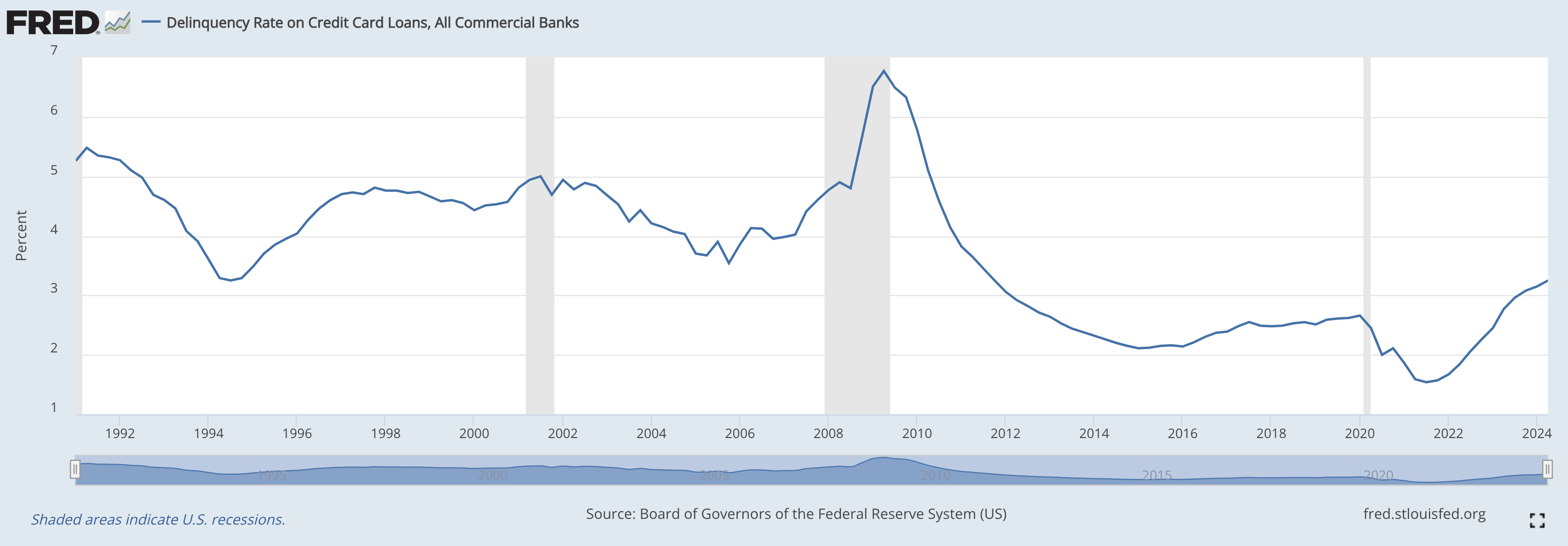
Bouncing off the chart above, this chart shows the credit card delinquency rates.
Essentially, how many people are defaulting on their credit card balances?
The delinquency rates are still very low compared with historical standards since the 1990’s.
Takeaway: Credit card delinquency rates remain low despite a rise in the actual value.
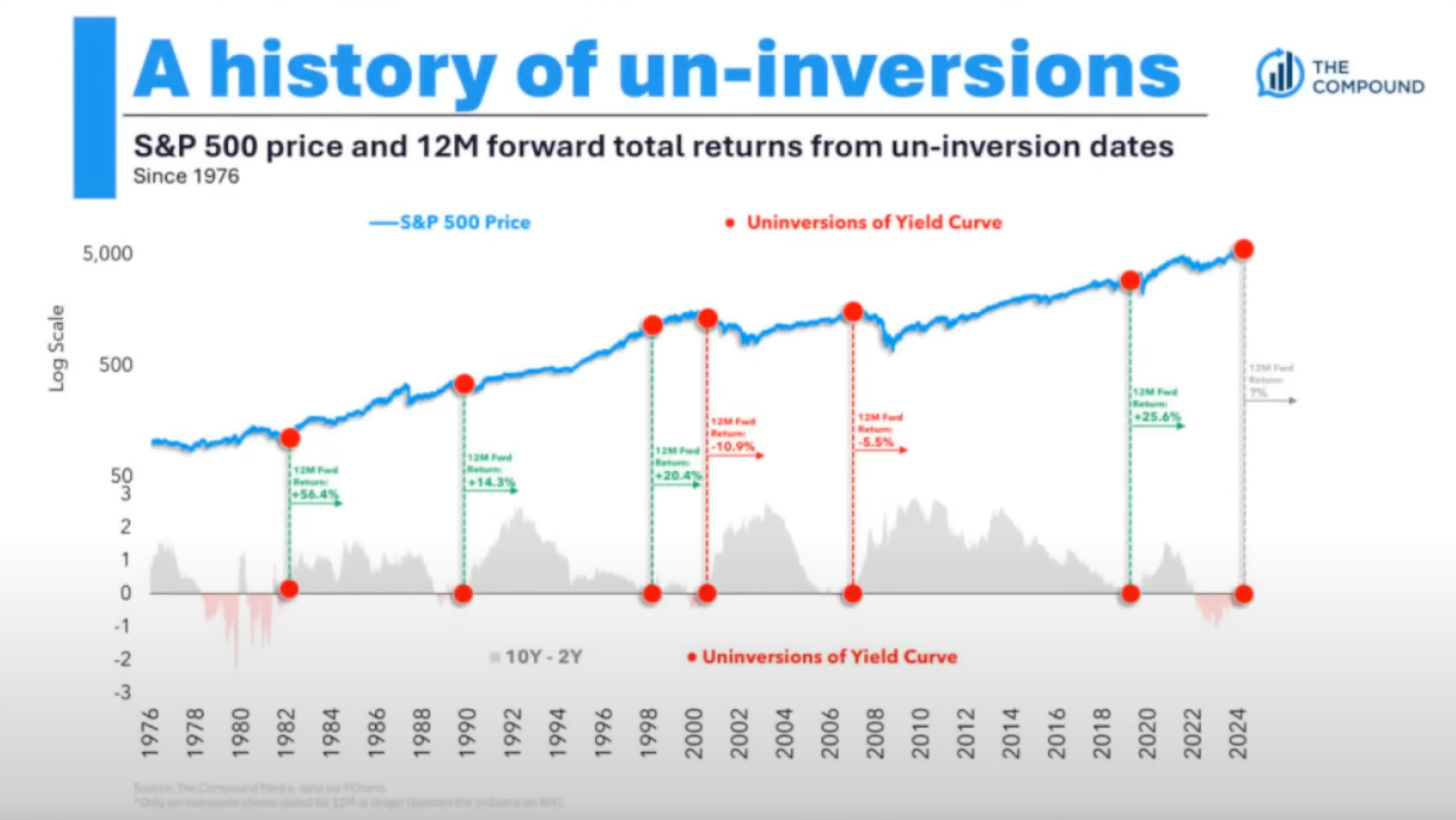
We’ve recently had an “un-inversion of the yield curve.”
In a normal yield curve the longer-term bonds have higher yields than short-term bonds. This is because you need to get paid more for the increased risk of holding a bond for a longer period of time.
An inverted yield curve occurs when short-term yields are larger than long-term yields.
When the yield curve un-inverts, it means that the short-term yields fall or the long-term yields rise (or a combination of both), resulting in a return to a normal yield curve shape.
These days everything breeds fear though.
The yield curve inverts and doomers scream for a recession.
When no recession comes the doomers wait for the un-inversion and scream for a recession even louder.
This chart shows the S&P 500 price in the blue line, and the red dots show the periods when the yield curve un-inverted.
The only negative 12 month returns after an un-inversion are from the Dot Com Bubble bust in 2000 and the Housing Crisis bust in 2008.
Those years look more like outliers rather than the norm though.
Oddly enough, everyone seems to focus most on the outliers for their next prediction.
Takeaway: Most yield curve un-inversions have positive 12 month returns.
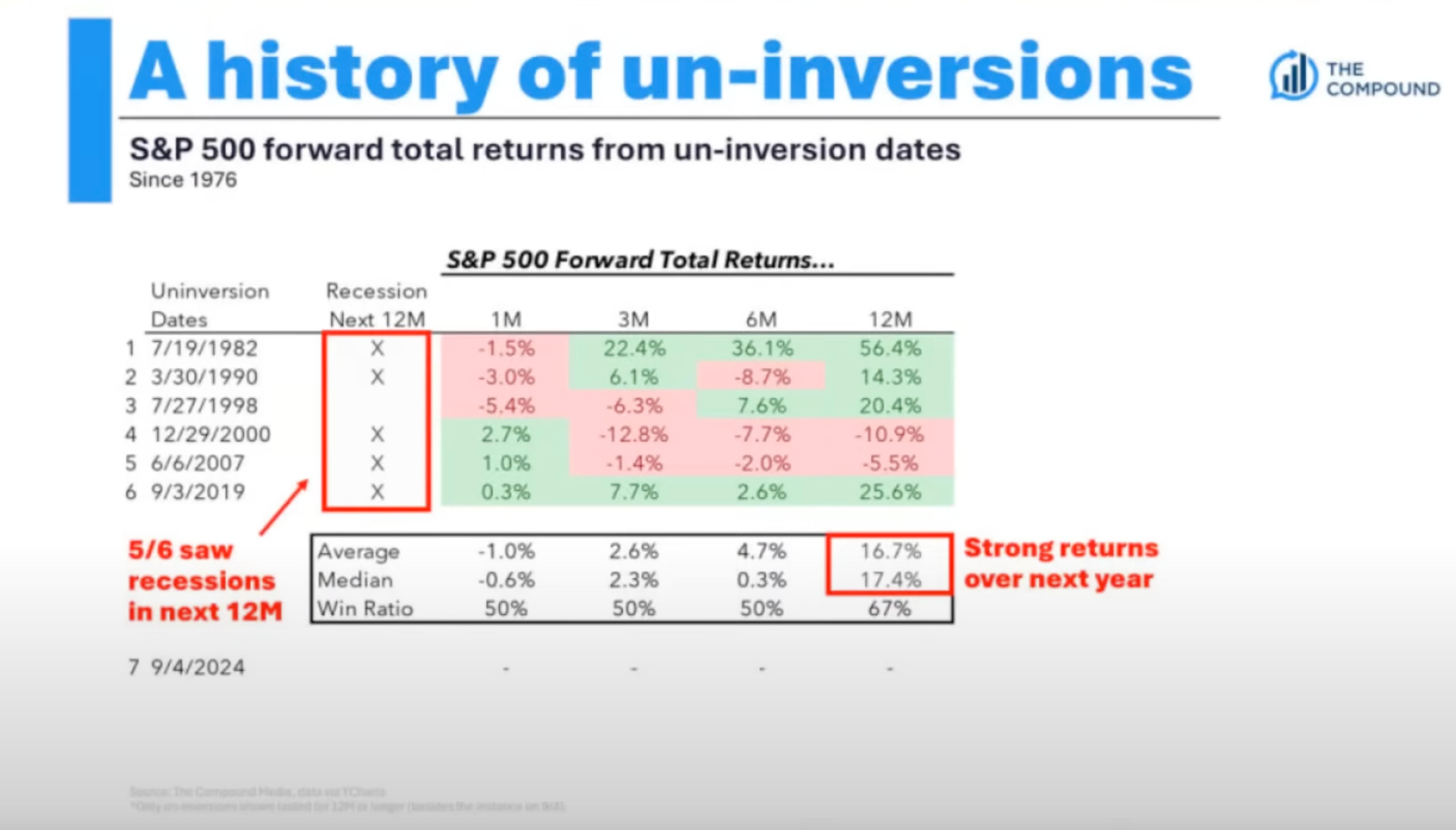
Bouncing off the chart above, the yield curve is just starting to un-invert and the doomers are coming out of the bushes to tell you how bearish of a signal this is.
Since 1982 however, the average 12 month return for the S&P 500 after the yield curve un-inverts is +16.7%.
The median return is 17.4%
Takeaway: Yield curve un-inversions don’t look so bearish after all.
I hope you enjoyed reading Simply Finance.
I write a small FREE NEWSLETTER here, so if you enjoyed this post the best way to help me out is to share it with others!
And don’t forget to subscribe so you don’t miss the next edition!
Disclaimer: These are not recommendations and I am not a financial advisor. These are just my two cents, or two satoshis as the kids say. Remember to do your own homework before making any financial decisions. Also, keep in mind I usually have some personal investments in the things I discuss.

Great point about intraday trading. A piece of advice from me: Never participate in it. The liquidity is so low your trades can easily go against you. You're right that buy and hold works best.
Excellent research this week, Christos. You've shared things I've never seen anywhere else. Most of the success I've had in my life has come from taking a contrarian viewpoint. However, you've helped me expand my thinking to help me avoid some contrarian traps. Although our investing philosophies differ, we are both successful investing being bullish, even if it's not the same things. I've learned from The 7 Habits of Highly Effective People that we should value our differences to come to the best outcome. Keep up the good work.