

Charts & Chit Chat: 13 Charts To Find Edge In Markets
Charts & Chit Chat: 13 Charts To Find Edge In Markets
Charts & Quick Takeaways To Make Better Financial Decisions

Here at Simply Finance we give you a high level of Financial Data alongside relatable stories to make sure learning about Finance isn’t so dry.
Let’s put some personality back in Finance.
Don’t be shy to hit the “like” button, share this post, and become a subscriber to this entirely FREE NEWSLETTER if you haven’t done so already!
Today’s edition is part of Charts & Chit Chat where I share Financial Data/Charts alongside quick takeaways that get right to the point.
My weekly Video Post will be next, and you can think of that as a coaching call where I chat about whatever is most relevant over the last week.
And of course we’ll have another edition of My Stories released within the next few days. That’s a long forum post where I share vulnerable thoughts around my opinions in Finance.
For now, let’s look at some data and get right to the point.
Below is a recap of my favorite Finance visuals and notes over the last week.
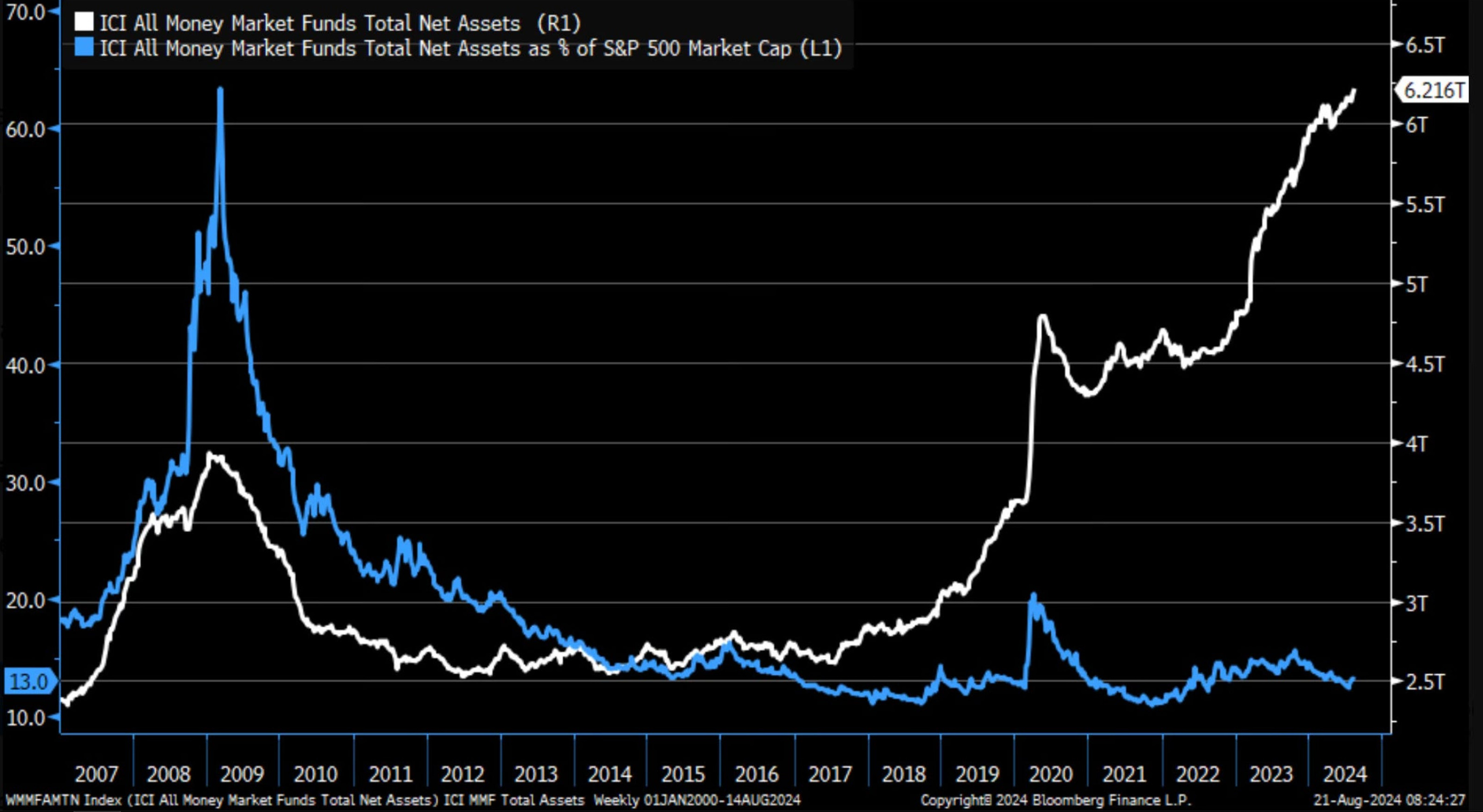
The cash levels in money market funds (white line) has been rising aggressively higher since 2012 and more notably 2017.
However, that same cash as a percentage of the S&P 500 (blue line) has been moving sideways to down that whole time.
So, despite all the cash entering money market funds (which is getting a 5% yield these days), it’s still greatly underperforming being invested in the S&P 500.
Said another way, the S&P 500 is appreciating much greater than the cash in money market funds is.
Takeaway: This is a great example of how holding too much cash for too long can cause too much underperformance.
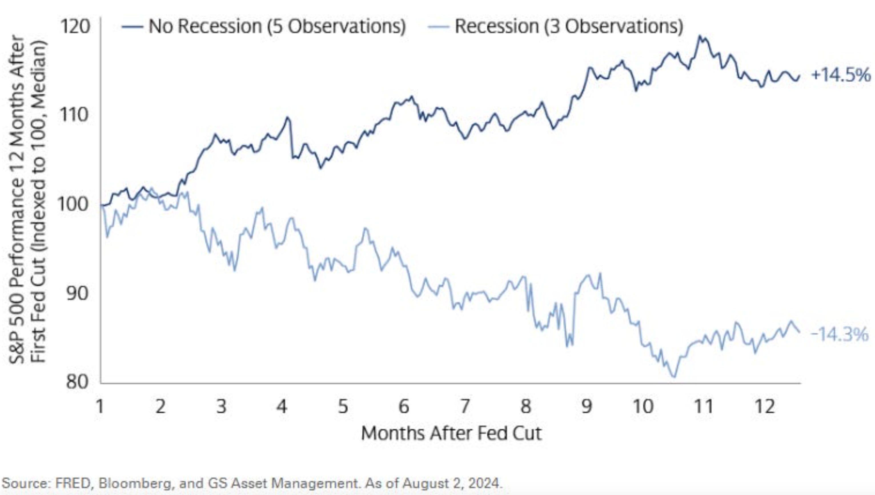
Rate cuts when there is not a recession (dark blue line) produces a median return of +14.5% 12 months after the first cut.
Rate cuts during a recession (light blue line) produces a median return of -14.3% 12 months after the first cut.
At the moment two things are clear. Rate cuts are coming, and we are not in a recession currently.
Takeaway: Rate cuts don’t always come during recessions, and when that is the case stocks do very well.
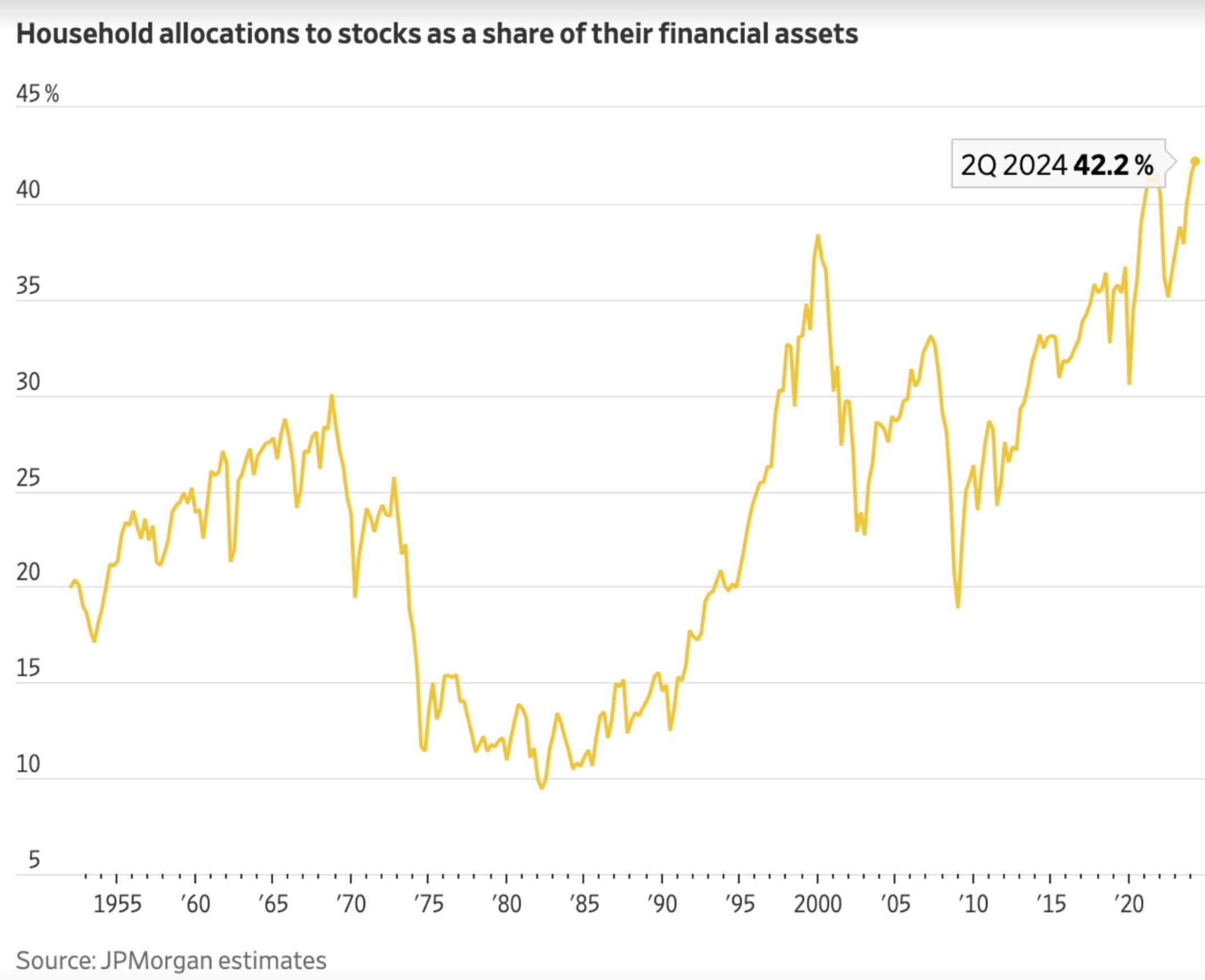
Household allocations to stocks as a percentage of their financial assets reaches new highs at 42%.
It’s great to see more households are invested in stocks.
Though, this rise is likely due more to the stock market rising rather than households purchasing more stocks.
Other metrics suggest that most are overweight cash and underweight stocks, which is unfortunate given that financial framework tends to underperform over the long run and especially currently.
Wealthier folks tend to own stocks and they are benefiting greatly from them. Those in control probably want to see that continue.
Takeaway: Stocks are becoming a bigger part of household wealth, and thus more important for the “powers that be” to protect that.
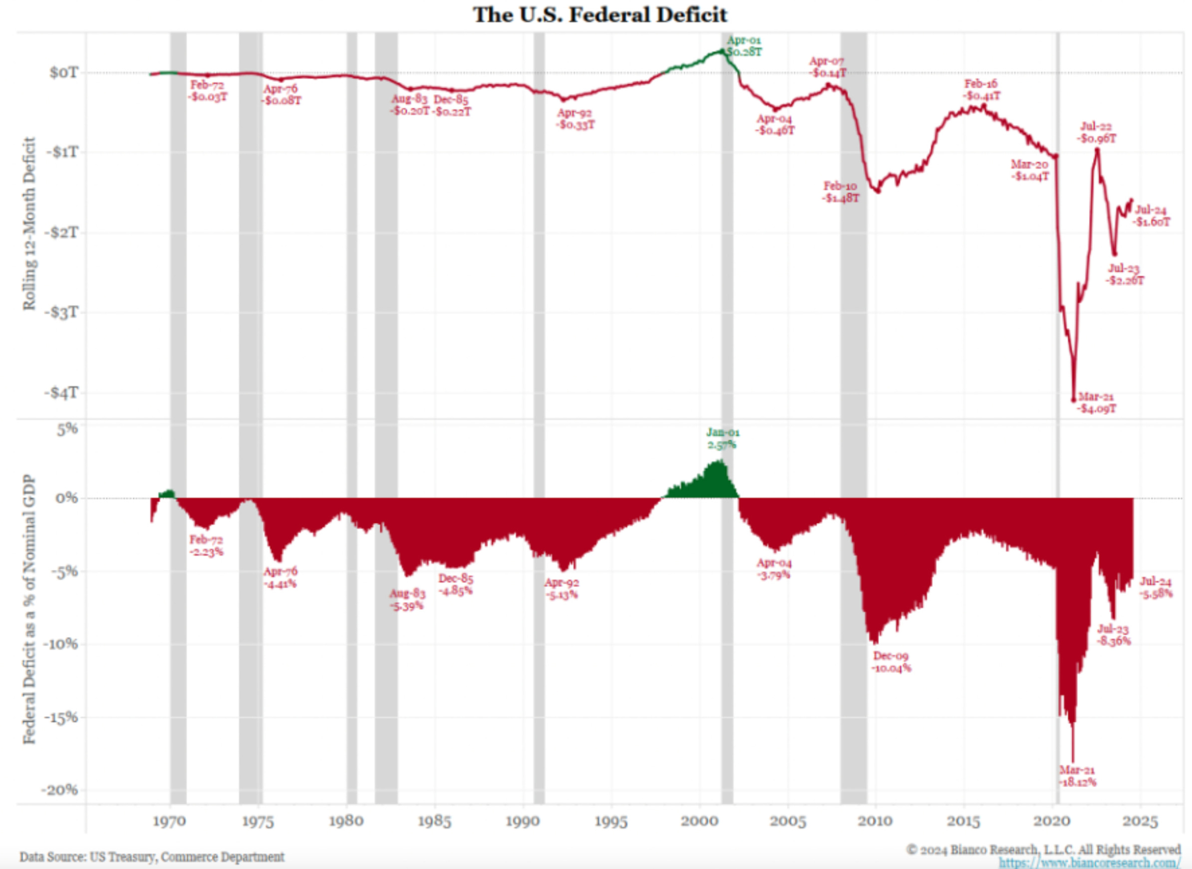
We are starting to run higher and higher Fiscal Deficits, especially as a percentage of GDP. That’s the red streaks you see growing larger since about 2005.
That means higher debt levels relative to the things we produce.
This is likely to grow exponentially until the end of time.
It started around the 2000’s and grew exponentially larger around 2008, and then even more around 2020.
This is part of the reason we’ve only been in a recession for 2 months in the last 16 years.
It’s hard to have a deep and broad recession when the government prints massive amounts of money for bailouts, handouts, and stimulus at every chance they get.
This keeps the system going at the expense of the US Dollar which is rapidly devaluing, but that’s better than a deep recession, and it also inflates asset prices along the way.
Win-win, right?
Takeaway: We have reached an era of running larger Fiscal Deficits that is going to be difficult to slow down or stop at this point, making it harder for deep recessions to show up in the US, but devalue the dollar more rapidly along the way.
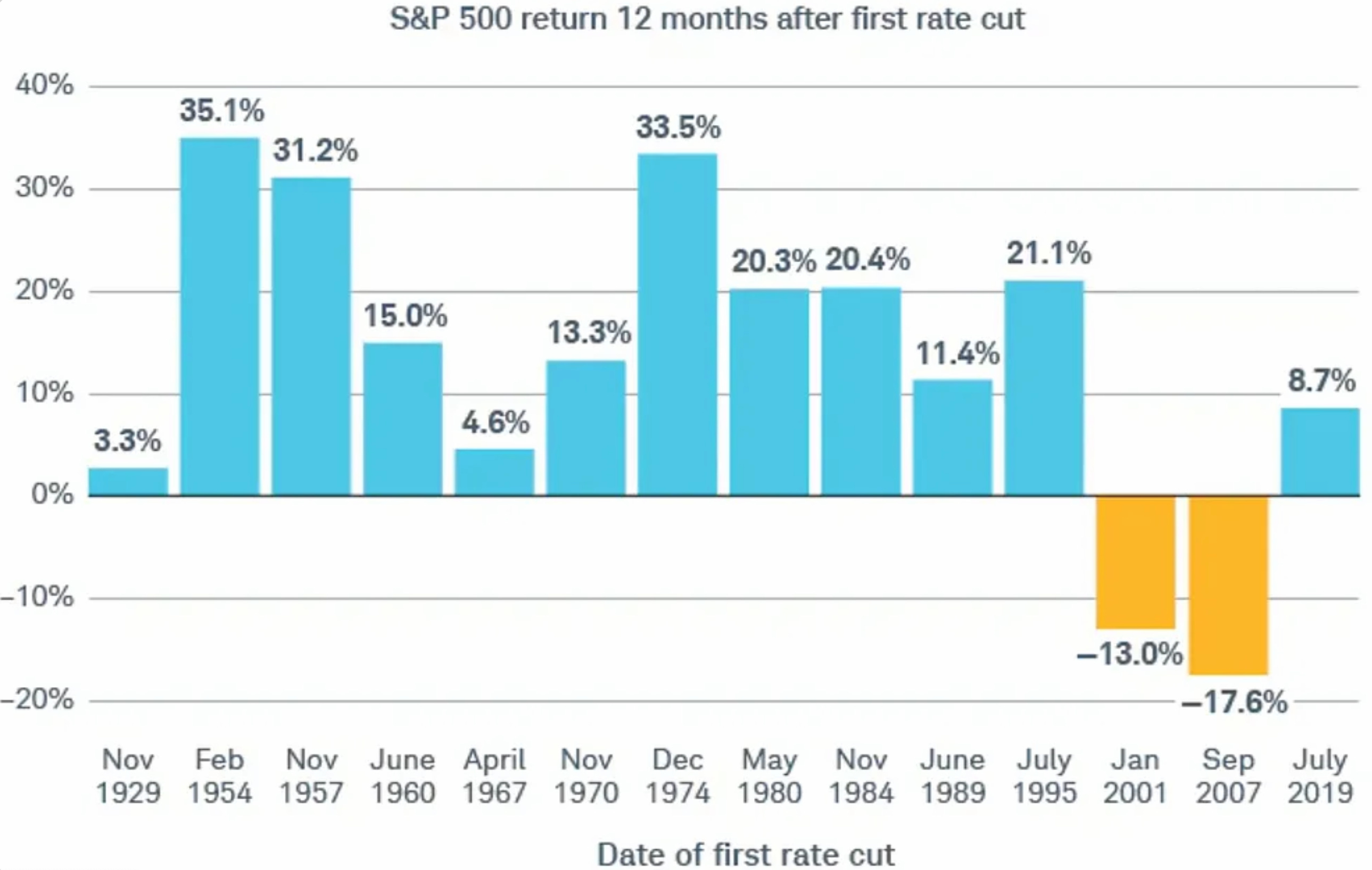
Here are the 12 month returns after the first rate cut from the FED.
Only 2 out of 14 years are negative. That’s 85% positive, which is similar to the chart I showed in my last Charts & Chit Chat edition around this topic.
The average positive return shown here is about +18%. This differs a bit from a few charts above which shows +14.5% for 12 month returns during non-recessionary rate cuts.
Different folks use slightly different data for different reasons. In any event, the trend is clear, and the trend is larger than the 7% - 12% historical long term average for the S&P 500.
Takeaway: Rate cuts tend to produce positive 12 month returns that are larger than historical long term averages.
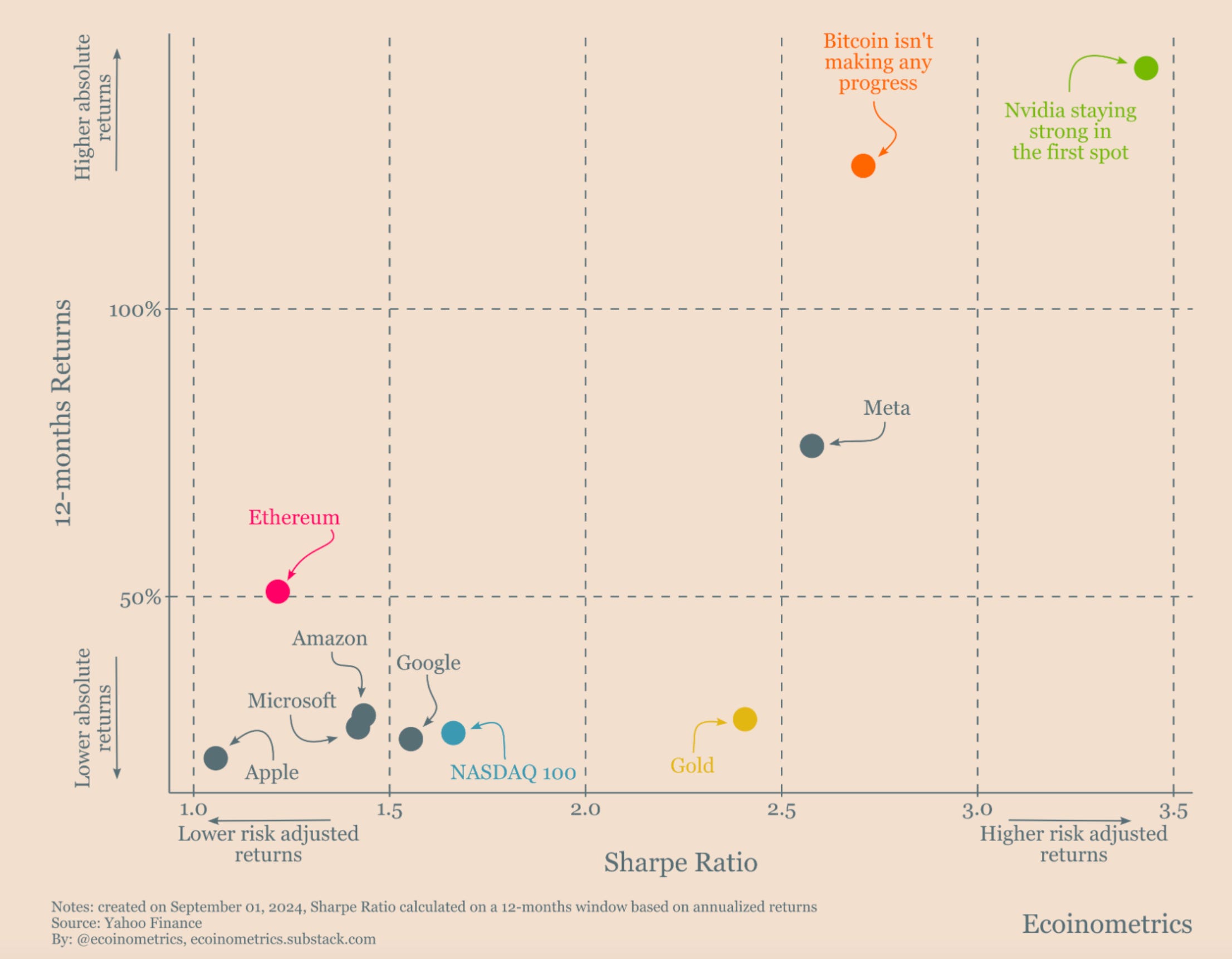
Bitcoin has always had one of the better risk-adjusted returns of any asset.
The best risk-adjusted return means it generates the most amount of reward relative to the risk (drawdown) that it had.
Over the last 12 months it has started to have some competition, most notably by NVDA.
META and Gold are also creeping closer.
The question is if this will be short lived.
It’s important to remember Bitcoin has been chopping sideways for 6 months not making much progress, while tech stocks and the Nasdaq in general have gained ground.
Gold has gained ground in that time too, and it’s not unusual for Gold to gain ground on Bitcoin every 3 years before Bitcoin makes a massive spike higher.
It’s also cool to see how high the Nasdaq is on this list given it’s a broad based index rather than an individual stock or crypto.
Takeaway: Despite the poor performance for Bitcoin over the last 6 months it still holds one of the best risk-adjusted returns over the last 12 months.
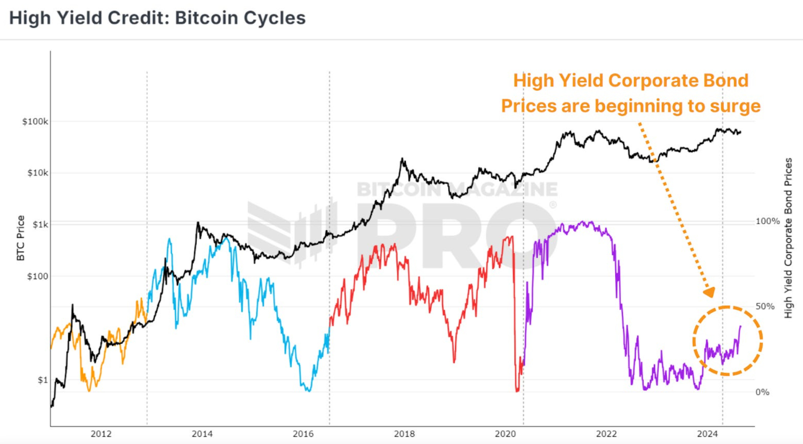
There’s an increase in demand for high yielding corporate bonds at the moment (purple line moving higher).
That means there’s an increase in risk appetite amongst investors.
This has historically coincided with an increase in Bitcoin’s price (black line), which rises during periods of increased demand for high yielding corporate bonds (the colored lines moving higher).
Takeway: Risk appetite amongst investors could be turning higher here.
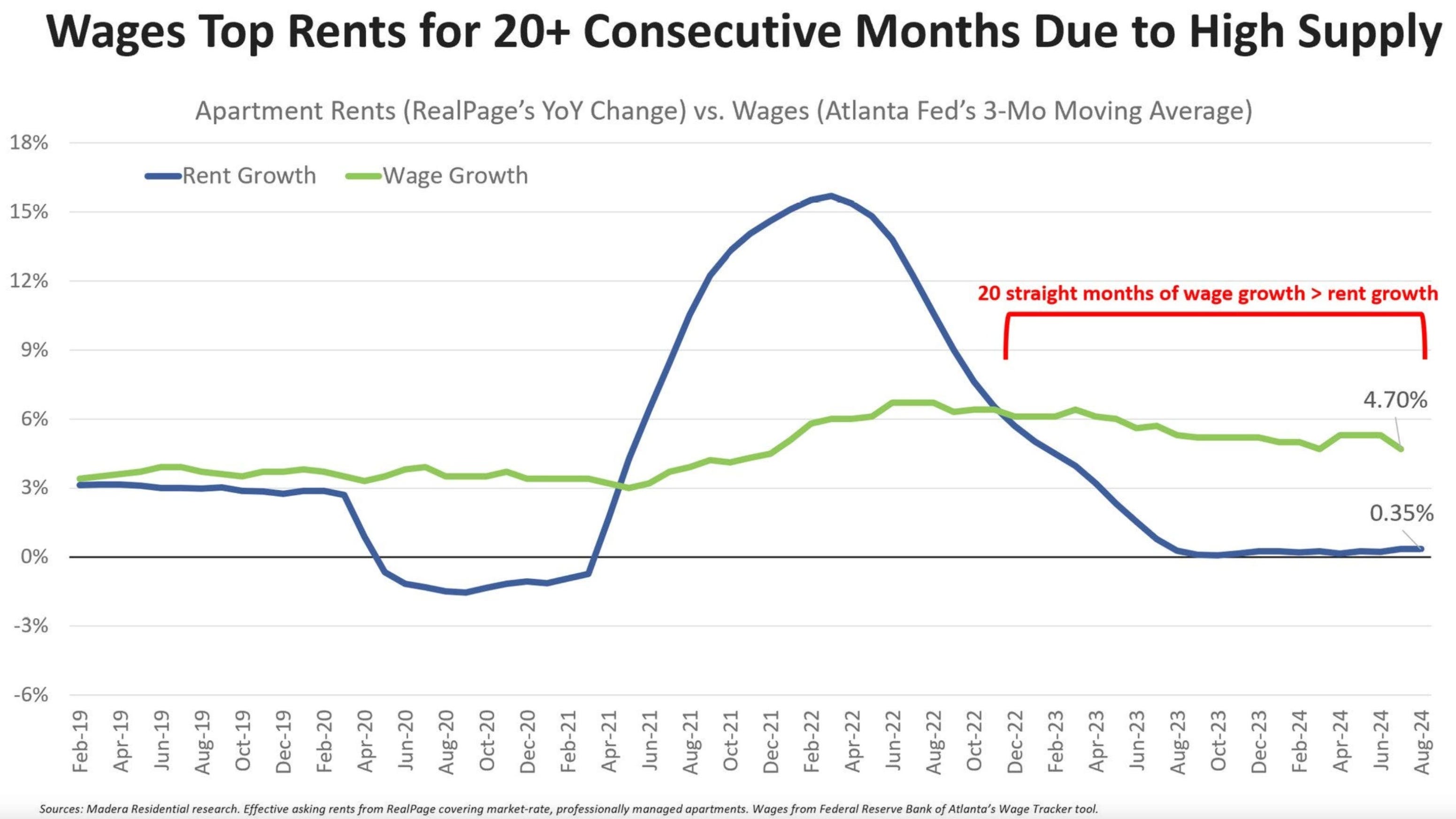
Unpopular chart for the doomers.
We just saw 20 straight months of wage growth (green line) that is larger than rent growth (blue line).
Wages growing faster than rent prices is just one piece to why the consumer has remained strong.
Takeaway: Wages have grown larger than rent increases for 20 straight months.
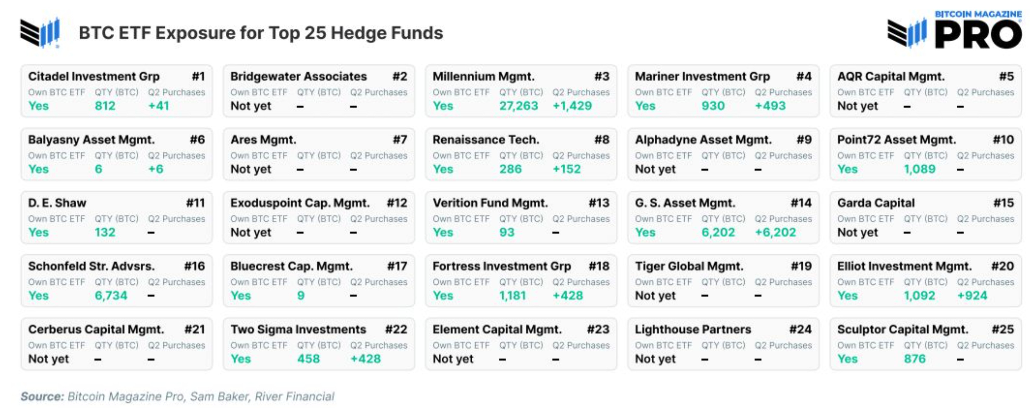
Bitcoin holdings for the top 25 Hedge Funds.
15 out of the top 25 Hedge Funds own Bitcoin.
7 of those 15 have added about half or all of their Bitcoin holdings in the second quarter of 2024 alone.
Takeaway: Bitcoin adoption is growing amongst the top Hedge Funds.
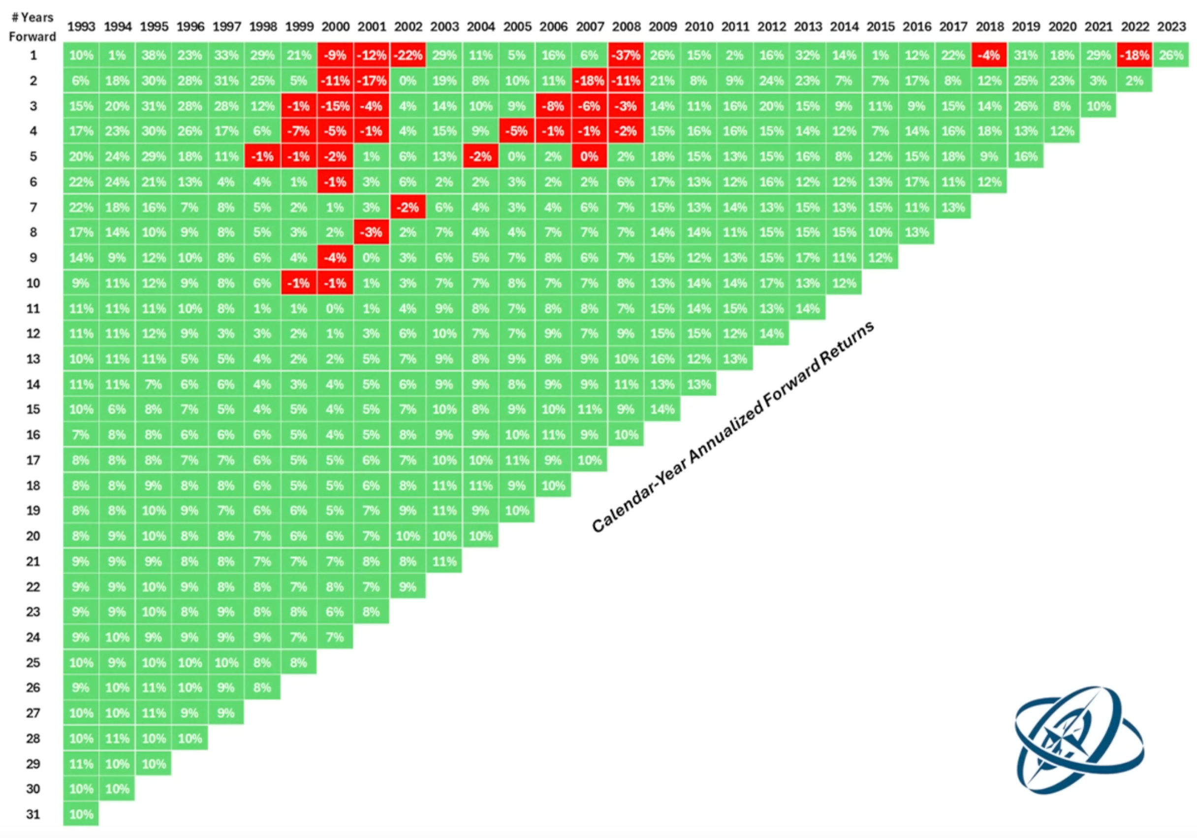
This graphic shows the annualized returns for the stock market on any given year dating back to 1993 up until today.
In that time there has never been an 11 year period that was negative for the investor.
There is very little red in general.
There are 21 data points after the 11 year mark.
16 out of 21 data points show a gain in the 7-15% annual return range. That’s 76% of the time you get at least a +7% return.
It also shows there’s about a 96% chance you are profitable after 6 years.
After 20 years the investor has been able to return at least +7% no matter what year they started investing. That’s at least a +7% annual return 100% of the time after a 20 year hold.
Takeaway: It’s almost never a bad time to start investing, especially if you are ready to buy more over the long term.
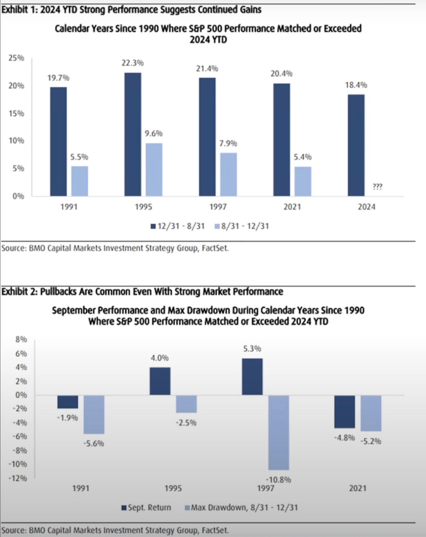
There are 4 other years since 1991 where the S&P 500 matched or exceeded the current 2024 return through August 31st. That’s the dark blue columns in the top half of the chart.
Each of those years saw another +5.4% to +9.6% rise in the last 4 months of the year. That’s the light blue columns in the top half of the chart.
This is true despite pullbacks of -2.5% to -10.8% in those last 4 months of the year. That’s the light blue columns in the bottom half of this chart.
Takeaway: The stock market tends to continue higher into the end of the year when it is this strong through August, and it will also include a normal pullback along the way.
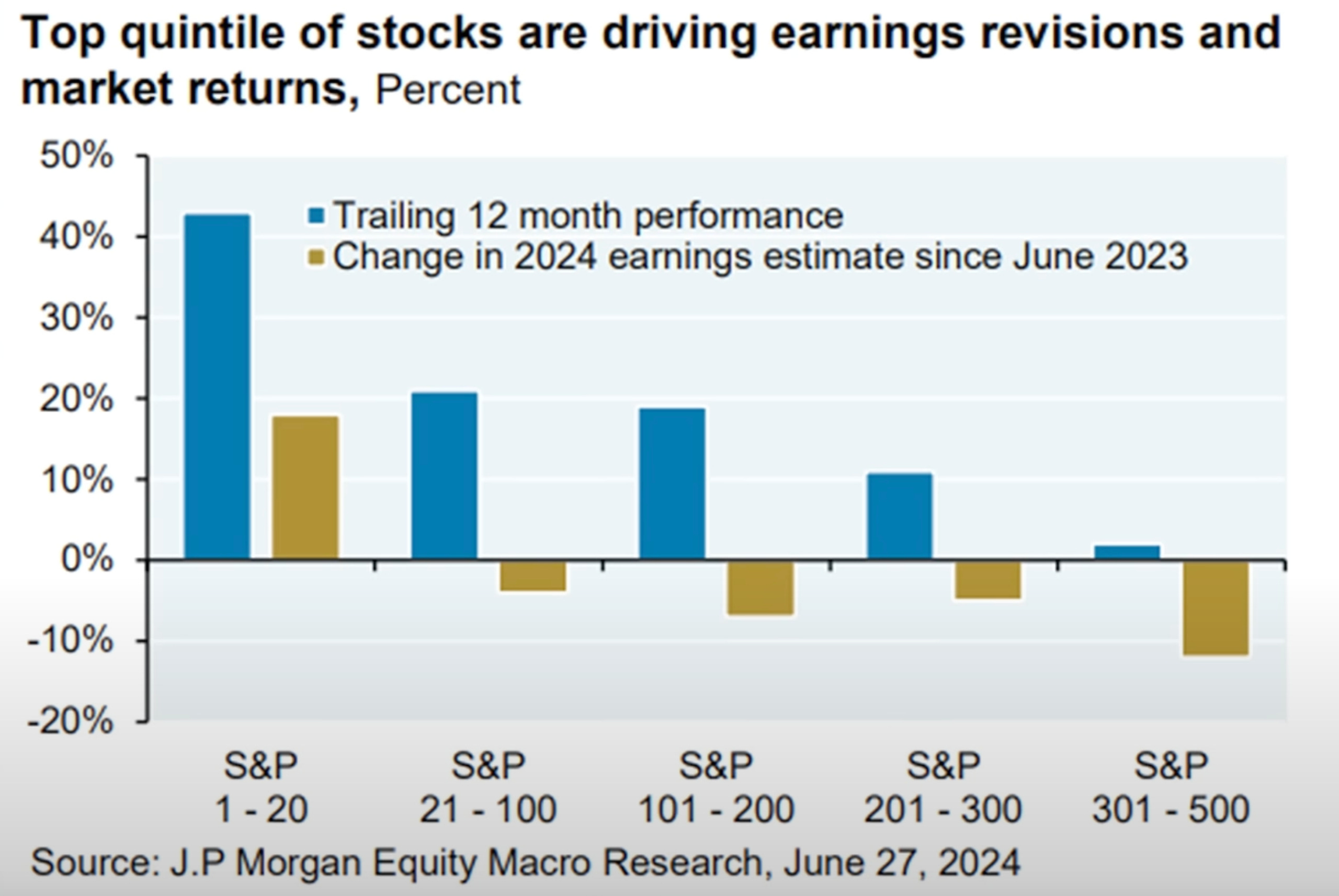
This chart’s horizontal access breaks the S&P 500 into cohorts based on market-cap weightings.
The first cohort shows the top 1-20 stocks in the index.
The blue columns represent the trailing 12 month performance for that cohort of stocks.
The gold columns represents the change in 2024 earnings estimates since June 2023 (about 12 months).
The blue column (trailing 12 month performance) for the top 20 stocks is the highest, indicating they have had the largest price appreciation relative to the other 480.
The gold column (change in 2024 earnings estimates) for the top 20 stocks is not only the highest, but also the only positive cohort, indicating they have had the largest earnings estimates over the last year relative to the other 480.
Takeaway: The returns of these top 20 stocks is justified relative to the rest, given they have had the largest earnings relative to the rest.
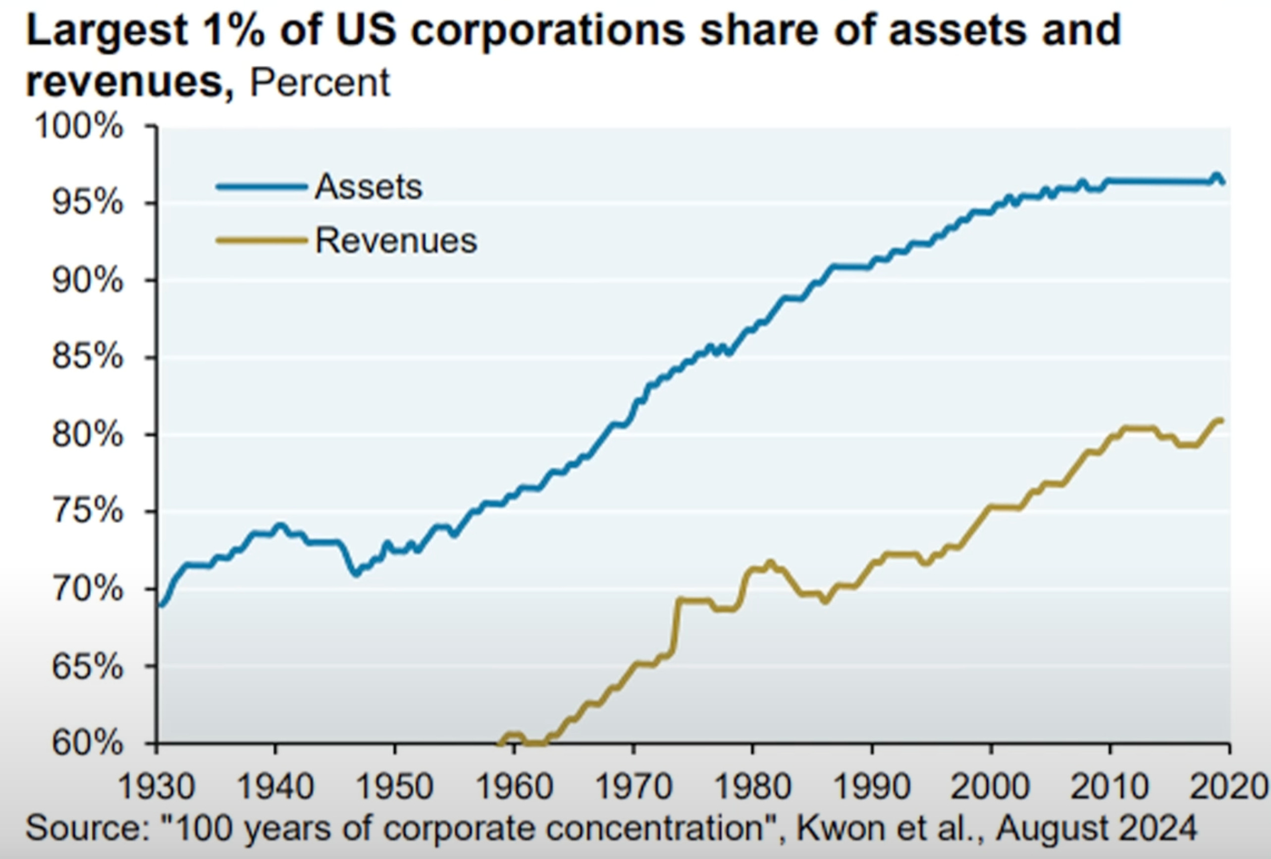
The largest 1% of Corporations own 96% of the assets and make 81% of the Revenues relative to all Corporations.
These percentages have also been increasing over time.
The rich get richer, both people and companies.
That’s why the largest companies in the world today are becoming more difficult to disrupt. They are growing into larger monopolies.
Takeaway: The rich grow richer compared with the rest over time, taking a larger share of everything and becoming harder to compete against.
I hope you enjoyed reading Simply Finance.
I write a small FREE NEWSLETTER here, so if you enjoyed this post the best way to help me out is to share it with others!
And don’t forget to subscribe so you don’t miss the next edition!
Disclaimer: These are not recommendations and I am not a financial advisor. These are just my two cents, or two satoshis as the kids say. Remember to do your own homework before making any financial decisions. Also, keep in mind I usually have some personal investments in the things I discuss.

I like the point about using Financial Easing to avoid recessions. The 2008 event could've been much worse than the 1929 recession if the global banking system had collapsed. But there's a price to pay - the devaluing US dollar (and other currencies). So the message is clear - be asset rich and cash poor.